Preview image. Unlock full-res
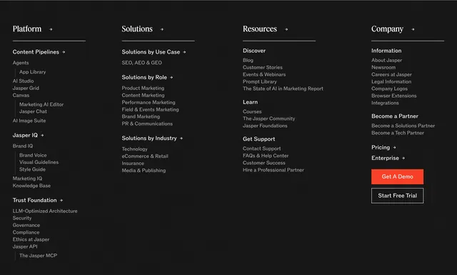
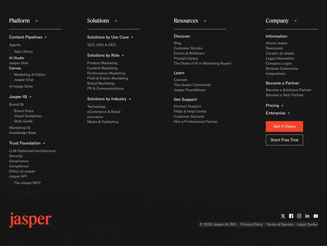
Dark charcoal footer with fine grid pattern, four link columns covering platform to company, stacked CTAs, and red serif logo bar with social icons.
Summary
A comprehensive dark footer with grid texture organizing Platform, Solutions, Resources, and Company links plus demo and trial buttons.
Visual description
Dark charcoal background with subtle light gray grid lines. Four columns with white serif headers and arrow accents. Platform column nests Content Pipelines, Jasper IQ, Trust Foundation with many sub-links (Agents, Canvas, Brand Voice, API, MCP). Solutions splits by use case, role, and industry. Resources covers Discover, Learn, Get Support. Company includes About, Careers, partners, Pricing and Enterprise links, and stacked orange Get A Demo plus outlined Start Free Trial. Bottom bar: large orange-red serif jasper logo left, white social icons (X, Facebook, Instagram, LinkedIn, YouTube) and gray copyright and legal links right.
Key takeaway
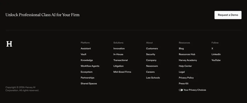
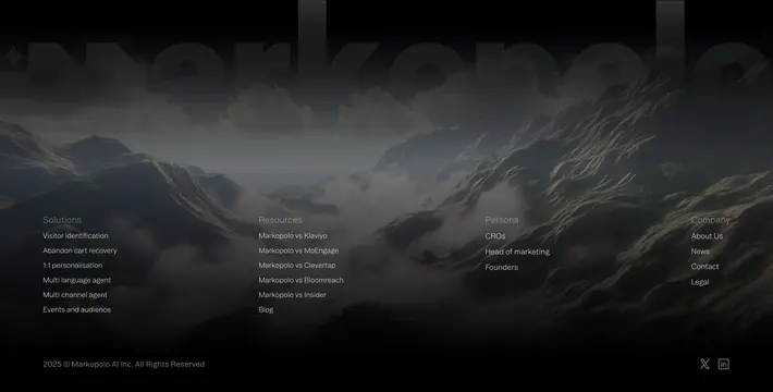
Serif column headers on a dark technical grid elevate a dense sitemap beyond default sans footers. Placing primary CTAs in the Company column catches bottom-scroll intent.
Reuse notes
For enterprise SaaS with deep IA. Four columns need collapse strategy on mobile. Grid texture adds brand character but must stay low contrast for readability.