Preview image. Unlock full-res
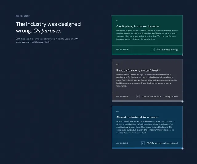
Split dark section pairing a manifesto headline with three numbered problem cards, each ending in a checked OUR RESPONSE footer bar.
Summary
Split dark section pairing a manifesto headline with three numbered problem cards, each ending in a checked OUR RESPONSE footer bar.
Visual description
Very dark navy textured background. Left column carries a small WHY WE EXIST eyebrow, a large headline mixing sans-serif white with italic serif emphasis on On purpose, and two lines of muted body copy about structural B2B data flaws. Right column stacks three full-width cards with thin white borders and blueprint corner ticks. Each card is numbered 01–03 in the top-left, uses a distinct muted jewel-tone fill (teal, charcoal-purple, deep blue), presents a bold problem title, supporting paragraph, then a separated footer labeled OUR RESPONSE with a checkbox icon and a one-line solution such as Flat rate data pricing, Source traceability on every record, and 390M+ records. All unmetered.
Key takeaway
Pairing industry critique with an immediate response footer inside each card keeps objections and answers in one scroll unit. Numbered cards with distinct background hues create rhythm without breaking the dark system. The manifesto left rail gives editorial weight while the right rail stays utilitarian.
Reuse notes
Use when positioning against entrenched category practices rather than named competitors. Each card should follow problem → explanation → our response for consistency. The split layout needs a strong left headline; avoid if the narrative cannot sustain three distinct structural critiques.