Preview image. Unlock full-res
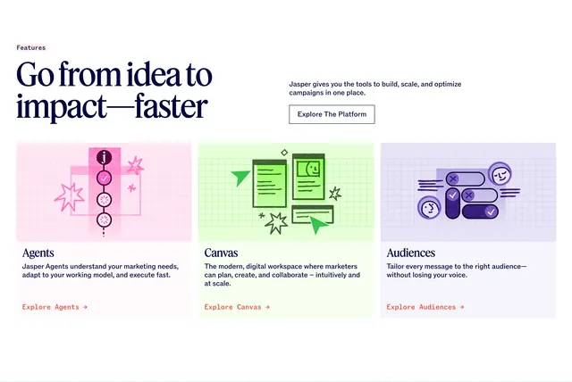
Split header with serif headline and explore button above three pastel cards for Agents, Canvas, and Audiences with sketchy grid illustrations.
Summary
A platform features section with asymmetric header and three equal cards pairing hand-drawn grid illustrations with serif titles and orange explore links.
Visual description
Top: pink "Features" tag, large navy serif headline "Go from idea to impact�faster" left, sub-copy and outlined Explore The Platform button right. Three cards below on pink, green, and purple pastel illustration areas with sketchy graph-paper doodles (Agents workflow circles with j logo, Canvas windows with green cursor, Audiences faces with check and X pills). Each card: serif title, sans-serif description, orange-red Explore link (Explore Agents, Explore Canvas, Explore Audiences).
Key takeaway
Lo-fi sketch illustrations humanize a technical platform trio without UI screenshots. Pastel top halves plus white text areas create consistent card rhythm.
Reuse notes
Works for three core product pillars with distinct visual metaphors. Illustrations must share one sketch style. Header asymmetry needs mobile stack order planning.