Preview image. Unlock full-res
Two-part section with intro copy and a gradient video card above a four-column grid of hand-drawn icons and value props.
Summary
"The Oyster edge" pairs left-aligned positioning copy with a yellow video card on the right, then expands into four equal columns of sketch icons and short benefit descriptions.
Visual description
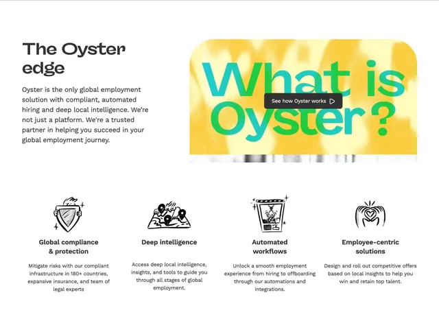
White background. Top row splits roughly half and half: left side has a large bold headline "The Oyster edge" and a paragraph on compliant automated hiring and local intelligence; right side is a large rounded rectangle with textured yellow fill, oversized teal-to-green gradient text reading "What is Oyster?", and a centered dark pill button with play icon labeled "See how Oyster works." A sliver of a video frame peeks below the card bottom. Bottom row is a four-column grid. Each column stacks a black hand-drawn icon (shield, map with pins, claw machine, hands forming a heart), a bold title, and gray body copy covering compliance, intelligence, automation, and employee-centric solutions. Generous whitespace separates both rows.
Key takeaway
The video card uses color and scale as the visual anchor while the four icons below carry the rational proof points. Sketch-style icons keep a dense feature grid from feeling like generic SaaS bullet tiles.
Reuse notes
Works when you need both emotional hook (video) and structured differentiation (pillars). The yellow card demands a strong brand accent color. Swap icons and copy per vertical; the two-tier layout scales to three or five columns with minor grid tweaks.