Preview image. Unlock full-res
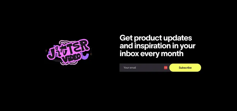
A two-column dark newsletter CTA pairing a playful sticker graphic with a bold headline and inline email signup.
Summary
A pure-black newsletter CTA split into a sticker-style graphic on the left and a bold white headline with an inline email field on the right. The defining detail is the glossy pink-and-purple "Jitter Video" sticker doing all the visual work against an otherwise empty black field.
Visual description
The section is full black with two zones. Left of center floats a chunky 3D sticker reading "Jitter Video" in bubbly pink letters with a white outline and purple shadow, slightly rotated for a playful tilt. On the right, a three-line bold white sans-serif headline reads "Get product updates and inspiration in your inbox every month". Below it sits a dark rounded input with placeholder "Your email" and a small red icon, joined by a bright yellow pill "Subscribe" button. Lots of negative black space surrounds both elements.
Key takeaway
Letting a single glossy sticker graphic carry the entire left side against flat black is a cheap, high-impact way to add personality to a newsletter block. The neon-yellow button is the one loud accent, so the eye lands straight on the action.
Reuse notes
Great for a brand with a playful, motion or creator-tool personality wanting an email capture that does not feel corporate. The sticker aesthetic suits y2k or maximalist brands; swap it out and the layout still works. Only reads well on a dark background where the yellow CTA can dominate.