Preview image. Unlock full-res
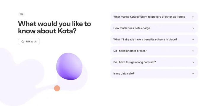
Two-column FAQ with lavender accordion rows on the right and headline plus Talk to us CTA on the left with 3D spheres.
Summary
Kota FAQ section combining a conversational headline and ghost Talk to us button with six lavender accordion questions.
Visual description
White layout split roughly 40/60. Left shows FAQ pill, bold question headline "What would you like to know about Kota?," outlined Talk to us button with speech icon, and decorative lavender blob with large purple and small orange 3D spheres. Right stacks six rounded lavender bars with broker, pricing, existing scheme, contract, and data safety questions plus chevron icons.
Key takeaway
FAQ as editorial layout: headline asks the user a question instead of labeling the block "FAQ" in giant type alone. Soft accordion pills feel less legal than bordered rows.
Reuse notes
Pairs well with sales-led B2B sites. Decorative spheres need space so they do not compete with accordion tap targets.
More faq sections
See all
More like this

Keep what you find
A free account saves references to boards and can send you a weekly email of picks based on what you save.
To see every result, go Pro.