Preview image. Unlock full-res
Split feature section with mobile onboarding mockups, audience headline, and three bento cards for startups, mid-sized teams, and developers.
Summary
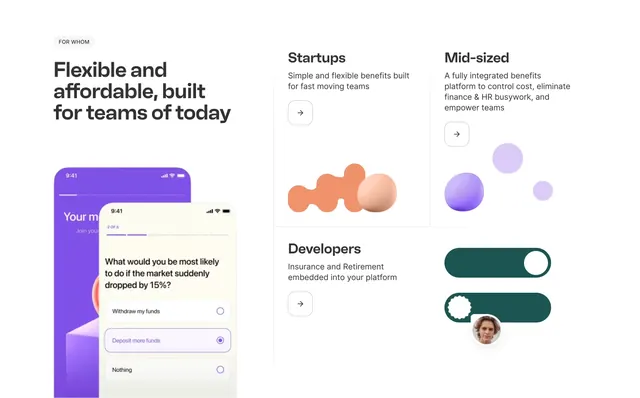
Kota "FOR WHOM" gateway pairing overlapping phone UI with a bento grid routing startups, mid-sized companies, and developers to tailored benefits stories.
Visual description
Light gray canvas. Left column: small FOR WHOM label, bold headline "Flexible and affordable, built for teams of today," and two overlapping phone mockups showing purple onboarding and a cream questionnaire screen with radio options and step 2 of 6 progress. Right side is a bento grid: Startups card with peach 3D blob and sphere plus arrow button; Mid-sized card with three lavender spheres; full-width Developers card with teal toggle switches, gear icon, and small profile avatar. Each card has short descriptive copy and circular arrow CTA.
Key takeaway
Segment routing via bento cards with distinct 3D or UI vignettes instead of identical icon rows. Overlapping phones make abstract benefits feel product-real.
Reuse notes
Strong for platform sites serving multiple ICPs. Each card needs a unique visual metaphor; generic stock icons will flatten the pattern.