Preview image. Unlock full-res
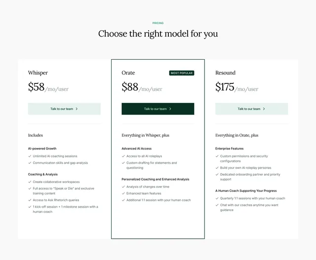
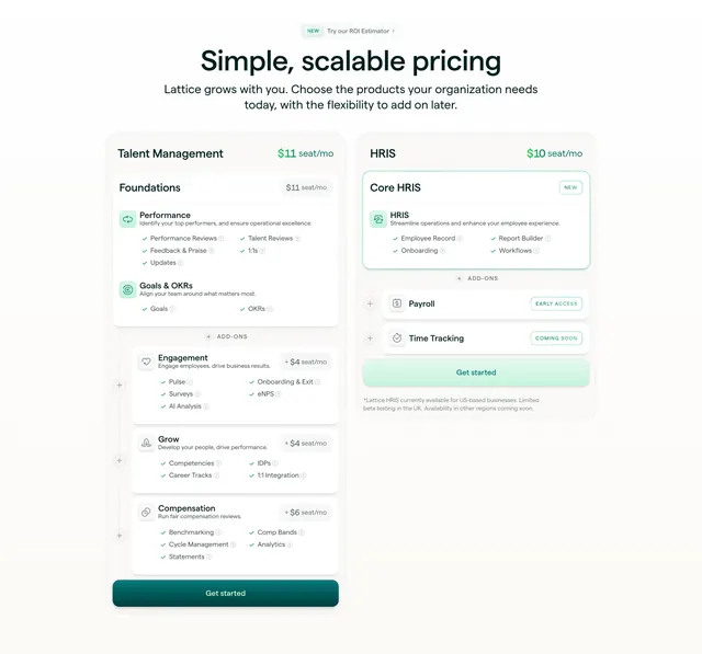
Two product pricing columns over a light background, each base plan stacking detachable add-on cards beneath it.
Summary
A two-column pricing layout where each plan is a base card with optional add-on modules stacked under it, each add-on showing its own incremental per-seat price. The defining idea is build-your-own pricing through detachable cards.
Visual description
Centered heading reads Simple, scalable pricing with a small NEW pill linking an ROI Estimator above it. Two columns sit below on a near-white background. The left column (Talent Management, 11 dollars per seat) opens with a Foundations base card listing features with green checkmarks grouped under Performance and Goals and OKRs, then an ADD-ONS divider followed by separate Engagement, Grow and Compensation cards each tagged with a plus-seat price and a small circular plus control on the left edge. The right column (Core HRIS, 10 dollars per seat) mirrors this with a base HRIS card plus Payroll (EARLY ACCESS) and Time Tracking (COMING SOON) add-on rows and status pills. Each column ends in a full-width filled dark-green Get started button. Feature rows use tiny info icons; a footnote in small gray text sits under the right column.
Key takeaway
Expressing modular pricing literally, base plan as a solid card with add-ons as visibly detached cards below carrying their own plus-price, so customers see the a-la-carte structure at a glance. Status pills (NEW, EARLY ACCESS, COMING SOON) communicate roadmap without leaving the pricing grid.
Reuse notes
Ideal for a product with a core plan plus optional modules priced per seat, especially platforms that bundle distinct capabilities. The detached-card pattern scales to many add-ons but can get tall, so it suits two columns rather than three or four. Green checkmark feature lists and info-icon tooltips keep dense feature sets scannable.