Preview image. Unlock full-res
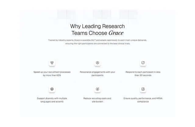
Centered why-choose-us section with serif-accented headline and a 3x2 grid of icon tiles separated by hairline rules.
Summary
Benefits grid for Grace listing six recruitment advantages in a ruled 3x2 layout with centered icons and short outcome copy.
Visual description
White background with faint square grid texture at top. Centered headline "Why Leading Research Teams Choose Grace" with Grace in italic serif, plus centered gray subcopy about 24/7 trained agents. Below, six cells in a 3x2 grid divided by thin gray lines. Each cell centers a small white rounded square with shadow holding a line icon, then a one-line benefit below (60% faster recruitment, personalization, sub-30-second response, multilingual support, cost reduction, HIPAA compliance).
Key takeaway
Hairline grid instead of bordered cards keeps six benefits readable without visual weight. Icon-in-elevated-tile pattern gives each cell a focal point without color.
Reuse notes
Good default for B2B capability matrices on white. Icons must stay simple at small size; long benefit copy will break the grid rhythm.