Preview image. Unlock full-res
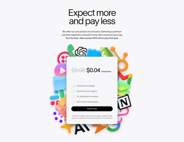
Light, playful pricing section with one white card showing a slashed per-interaction price, floating over a vibrant 3D cluster of integration app icons.
Summary
A centered, single-plan pricing section on a light background. One clean white card sits over a vivid, glossy 3D pile of integration app icons, leading with a struck-through price reduced to a low per-interaction rate.
Visual description
Off-white background with a centered serif headline ("Expect more and pay less") and a short three-line supporting paragraph promising a free trial and 50% off the first year. Behind and around a single rounded white pricing card sits a dense, colorful cluster of glossy 3D app and integration icons (chat, AI, calendar, notes, payments, and more) spilling out past the card edges. The card shows a grey struck-through price next to a bold active price with a "/Interaction" unit, then four feature rows each with a pill toggle (Unlimited knowledge, Unlimited phone agents, 10+ Workplace members, Self-hosted data solution), a full-width black "Try For Free" pill button, and a small footnote defining an interaction.
Key takeaway
Usage-based pricing made tangible: a single card with a strikethrough anchored to a tiny per-interaction number reads as cheap and fair. The colorful 3D integration pile turns an empty pricing background into a product story (look how much it connects to) while the calm white card keeps the actual offer readable.
Reuse notes
Great for a single-plan or usage-priced product, especially AI tools billed per action. The 3D icon cluster needs real rendered assets and can feel busy; keep the card high-contrast and well-padded so the price stays the focus. Best on light backgrounds where the glossy icons pop.