Preview image. Unlock full-res
Tabbed feature section switching between product areas, with a split copy-and-UI panel inside a contained frame.
Summary
A tabbed features block that lets the visitor switch between three product areas, each revealing a split layout of headline copy on the left and a product UI panel on the right. The defining trait is the three-tab control bar sitting above a contained, bordered content frame.
Visual description
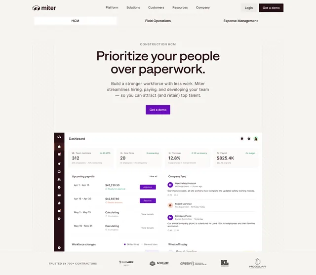
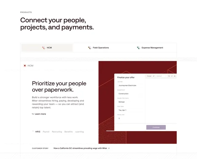
A small grey "PRODUCTS" eyebrow tops a two-line black sans-serif headline, "Connect your people, projects, and payments." Below sits a full-width tab bar with three labeled items, each with a small isometric icon: HCM (active, highlighted in pale beige), Field Operations, and Expense Management. The active panel below shows a left column with a red dot label, the heading "Prioritize your people over paperwork.", a short paragraph, an arrow "Learn more" link, and a row of sub-tabs (HRIS, Payroll, Recruiting, Benefits, Learning). The right column is a deep maroon panel with a dotted-texture fill, containing a floating white "Finalize your offer" form with labeled fields and a lavender Continue button. A "CUSTOMER STORY" link runs along the bottom edge.
Key takeaway
The two-level tab system: top-level product tabs plus an inner row of feature sub-tabs, letting one section stand in for many feature pages. The maroon panel with a subtle dotted texture and a single floating UI card gives the screenshot a branded backdrop instead of a flat crop.
Reuse notes
Strong for a multi-product platform that needs to compress several feature stories into one switchable block. The contained frame and dotted texture keep it from feeling generic. Needs real product UI to fill the right panel, and the brand accent color drives the whole section, so swap the maroon to rebrand.