Preview image. Unlock full-res
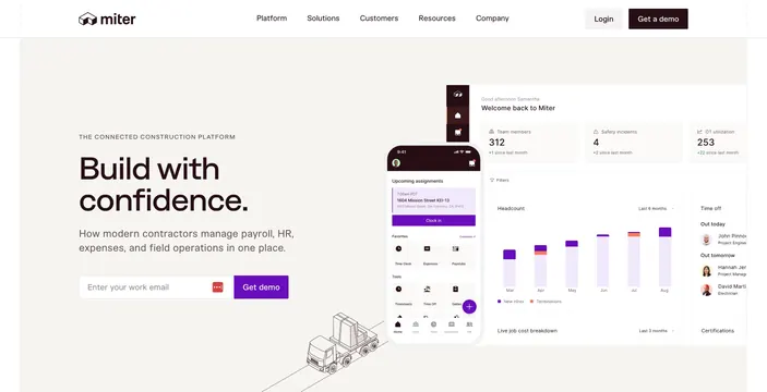
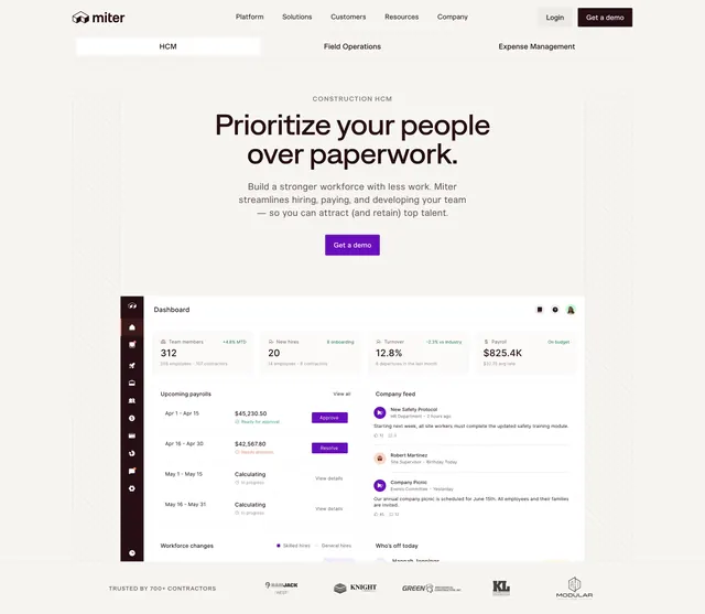
Centered hero with an eyebrow, oversized headline and single CTA above a large product dashboard and a contractor logo strip.
Summary
A centered hero that stacks an eyebrow, an oversized two-line headline, a single demo CTA, and then a large product dashboard, closing with a partner logo strip. The defining trait is the symmetry: everything is center-aligned above a wide dashboard screenshot.
Visual description
A thin navbar carries the Miter wordmark, a centered menu, and Login plus a dark "Get a demo" button. Centered below sits a grey "CONSTRUCTION HCM" eyebrow, a large black headline "Prioritize your people over paperwork." across two lines, a short muted supporting sentence, and one dark "Get a demo" button. Underneath, a full "Dashboard" product screenshot fills the width: a left icon rail, a row of metric cards (Team members 312, New hires 20, Turnover 12.8%, Payroll $825.4K), an "Upcoming payrolls" list with status pills and violet action buttons, a "Company feed" with avatar entries, and a partial "Workforce changes" and "Who's off today" block at the bottom. Faint diagonal hatching frames the left and right margins. A grey "TRUSTED BY 700+ CONTRACTORS" label and a row of muted partner logos run across the very bottom.
Key takeaway
The strict centered stack that funnels attention straight down from eyebrow to headline to one CTA, then hands off to a single large dashboard with no competing elements. Tucking the trust logos directly under the hero keeps social proof above the fold.
Reuse notes
Use when one clear product view can carry the hero and you want a calmer, more symmetric alternative to a split layout. Single CTA keeps the focus tight. The dashboard must be detailed and legible since it dominates the lower half; the diagonal hatching is a light brand cue that needs clean edges.