Preview image. Unlock full-res
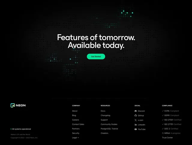
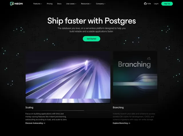
Dark centered hero with a green pill CTA and two side-by-side product feature cards over a starry dotted background.
Summary
A dark, centered hero with a green pill CTA over a starry dotted field, followed by two side-by-side feature cards (Scaling and Branching) each pairing an abstract gradient visual with a short description.
Visual description
Top nav holds the Neon logo and wordmark left, dropdown menus center (Features, Pricing, Docs, Use cases, Resources, Company), and a GitHub star count (15.9k), Log In, and a green "Sign Up" pill right. Centered hero copy: a single-line headline "Ship faster with Postgres," a two-line grey sub-paragraph, and one green pill CTA "Get Started." The background is near-black scattered with faint star-like dots, some glowing teal. Below sit two equal feature cards: the left "Scaling" card shows a purple-streaked perspective gradient visual above a bold label, grey body copy, and a "Discover Autoscaling" link with an arrow; the right "Branching" card shows a darker green-and-grey abstract visual with the word "Branching" rendered into it, above its label, copy, and an "Explore Branching" link.
Key takeaway
Putting two feature cards directly inside the hero compresses the headline and the first two product capabilities into a single above-the-fold view. The GitHub star count in the nav doubles as social proof at the top of the page. Abstract gradient art (rather than literal screenshots) keeps the dark hero clean while still giving each card a distinct visual identity.
Reuse notes
Suits a database or developer platform that wants to lead with two flagship features rather than one big screenshot. The abstract visuals need to feel on-brand and distinct from each other. Dark palette with a single green accent only works in dark mode; the star count assumes an active open-source repo.