Preview image. Unlock full-res
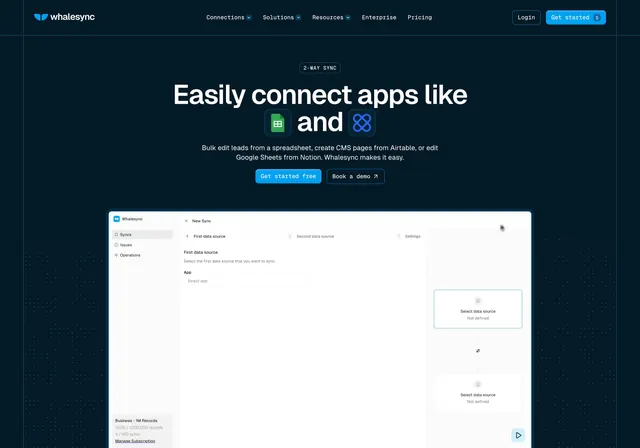
Centered dark hero where two app-logo tiles are set inline within the headline, over a faint dot field, above a wide sync-wizard product screenshot.
Summary
A centered dark hero whose headline embeds two app-logo tiles inline ("connect apps like [Sheets] and [Airtable]"), over a dotted field and above a sync-creation wizard screenshot. The defining move is swapping nouns in the headline for live product logos.
Visual description
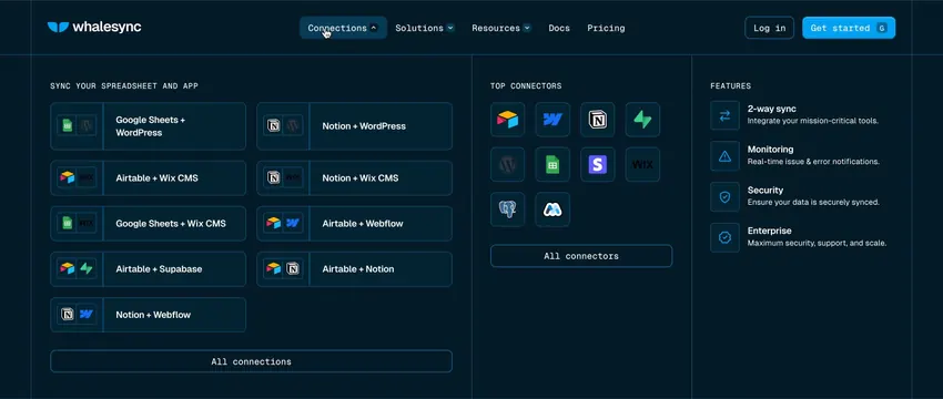
Deep navy background with faint corner guides. A navbar holds the whalesync wordmark at left, Connections / Solutions / Resources / Enterprise / Pricing centered, and Login plus a blue "Get started" button at right. Centered below, a small "2-WAY SYNC" pill badge sits above a bold white headline that reads "Easily connect apps like" then, on the second line, a green Google Sheets icon tile, the word "and," and a blue Airtable icon tile. Two grey sub-copy lines follow, then a blue "Get started free" button and an outlined "Book a demo" button, both in a monospace face. A faint dot grid sits behind the type. Beneath it, a large product screenshot shows a "New Sync" wizard: a stepper (First data source, Second data source, Settings), an App select field, and a right-side panel with two "Select data source" cards joined by a sync connector.
Key takeaway
Placing real, rounded app-logo tiles directly inside the headline text so the integrations become the message itself. The inline-logo trick instantly communicates what connects to what before the screenshot loads.
Reuse notes
Ideal for integration and sync products with two clearly branded endpoints to feature. The logo tiles must be sized to sit on the type baseline cleanly. Only works on dark here; needs a tidy wizard or builder screenshot to anchor the lower half.