Preview image. Unlock full-res
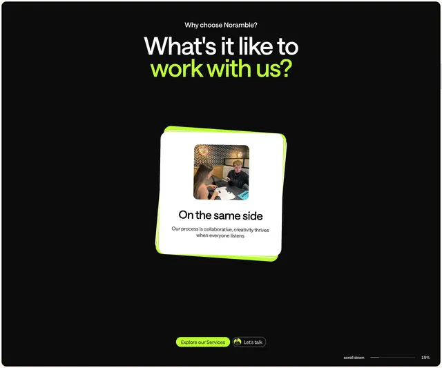
Dark feature section with lime-green headline accent, tilted white benefit card, and dual CTAs.
Summary
A dark benefits block leading with an oversized two-tone headline and a single tilted white card that sells the collaborative studio experience.
Visual description
Black background with small white eyebrow "Why choose Noramble?" above a large centered headline where "work with us?" is lime green and the rest is white. One white rounded card sits center, tilted right with a lime-green offset shadow stack behind it. The card holds a small team photo, bold title "On the same side," and short body copy. Two pill CTAs below: filled lime "Explore our Services" and ghost "Let's talk" with a circular avatar. Scroll progress reads 19% bottom right.
Key takeaway
The stacked lime shadow behind a tilted card makes one testimonial-style benefit feel physical without a carousel. Split-color headline on black is a fast brand signature.
Reuse notes
Agency or studio "why us" sections on dark pages. Needs one strong photo and a single clear benefit; works best with a neon accent already in the brand palette.