Preview image. Unlock full-res
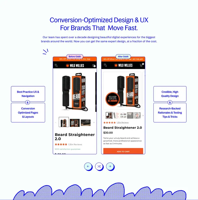
Centered before-and-after mobile product page comparison flanked by four conversion design benefit callouts on a white background.
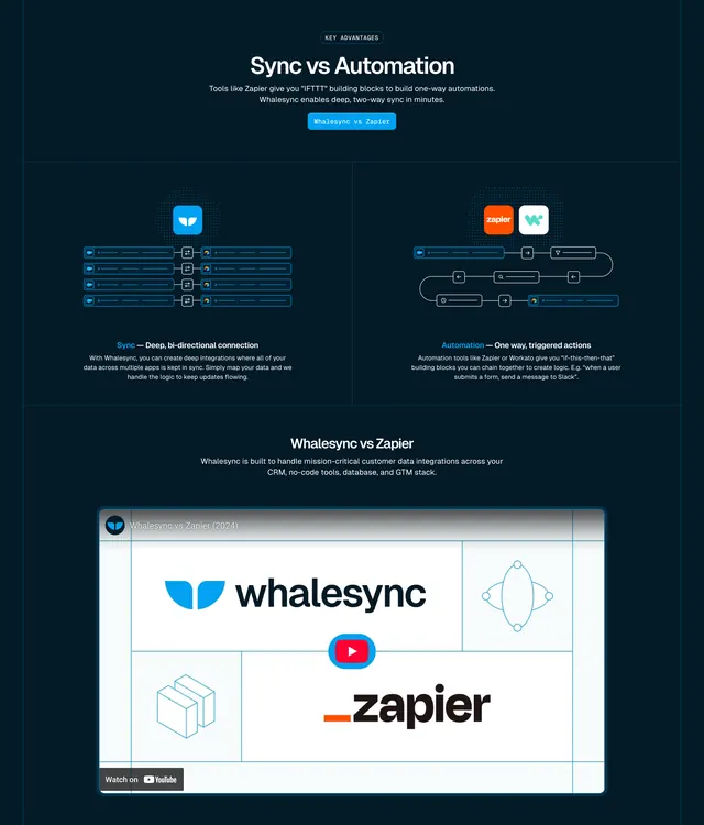
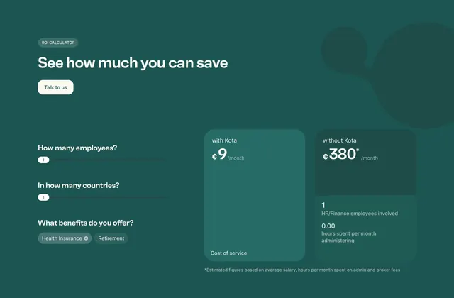
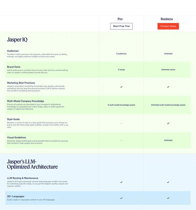
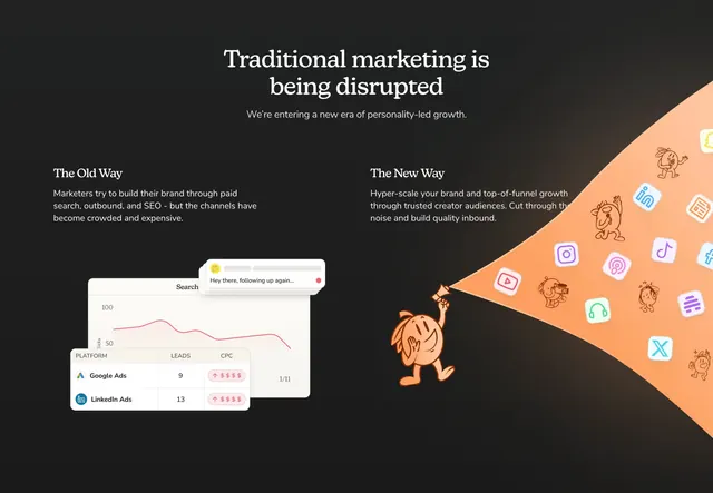
Summary
A before-and-after mobile PDP comparison for Wild Willies beard straightener with four flanking benefit boxes on conversion UX practices.
Visual description
White section with centered blue headline on conversion-optimized design for fast brands and supporting subcopy on decade of expertise. Center: two phone mockups labeled "Before Oddit" and "After Oddit" in pill tags. Before shows basic product photo, three thumbnails, and title. After adds benefit overlay on hero image, five thumbnails with video, ratings above title, persuasive description, and orange ADD TO CART button. Four blue-outlined boxes with ampersand connectors list best-practice UX, conversion layouts, credible design, and research-backed rationales. Blue carousel arrows and halftone wavy border at bottom.
Key takeaway
Side-by-side mobile PDPs make abstract CRO services tangible. Pill labels and benefit callout boxes frame the comparison without extra prose.
Reuse notes
CRO agencies and ecommerce optimizers. Needs a real client before state; orange CTA contrast is key to showing the after improvement.