Preview image. Unlock full-res
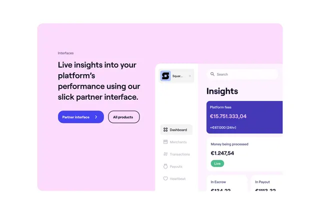
Light pink rounded feature block with copy and CTAs on the left and a cropped partner dashboard UI mockup on the right.
Summary
A contained feature section on a pale pink card that pairs marketing copy with a realistic partner-dashboard screenshot showing live financial metrics.
Visual description
Large rounded rectangle on white page background, filled with soft blush pink. Left column: small "Interfaces" label, bold black headline about live platform performance via the partner interface, then two pill buttons, a filled blue "Partner interface" with chevron and an outlined white "All products." Right column shows a cropped SaaS dashboard: left sidebar with logo dropdown, nav items (Dashboard active, Merchants, Transactions, Payouts, Heartbeat), and main panel with search bar, "Insights" heading, a dark blue "Platform fees" stat card showing a large euro total plus 24hr delta, a white card with live euro amount and green "Live" badge, and partial cards for Escrow and Payout below.
Key takeaway
The pastel wrapper that makes a dense dashboard preview feel approachable rather than intimidating. Pairing one primary filled CTA with a secondary outline keeps focus on the featured product while still offering an escape hatch.
Reuse notes
Ideal for fintech or B2B SaaS product pages where the UI is the proof. Needs a strong screenshot; the pink surround only works if it matches broader brand pastels. Source tags mention Video but no play control is visible in this still.