Preview image. Unlock full-res
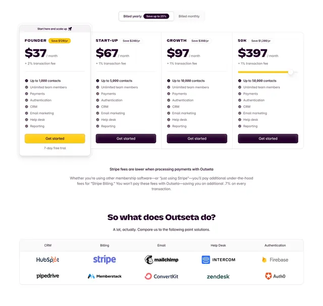
Light-mode SaaS pricing with four horizontal tiers, a yearly/monthly toggle, and a competitor-replacement comparison table below.
Summary
A four-column pricing block on white with a billing-period toggle, one highlighted starter tier, and a five-column feature comparison grid that positions the product against point solutions.
Visual description
Centered billing toggle at top: "Billed yearly" selected with a dark pill badge reading "Save up to 25%." Four equal-width pricing cards sit in a row. The first card (FOUNDER) is visually elevated with a light gray background, a "Start here and scale up" label, a yellow "Save $120/yr" badge, and a bright yellow filled "Get started" button; the other three tiers use dark purple filled buttons. Each card shows an all-caps plan name, monthly price plus transaction-fee percentage, a short feature checklist with checkmarks, and a "7-day free trial" note on the first tier. The 50K tier includes a yellow horizontal slider beneath the price. Below the cards, a short paragraph explains Stripe fee savings. The lower section, "So what does Outseta do?", is a bordered comparison table with five columns (CRM, Billing, Email, Help Desk, Authentication) listing competitor logos such as HubSpot, Stripe, Mailchimp, Intercom, and Firebase.
Key takeaway
The recommended-tier treatment: subtle background shift, savings badge, and a contrasting yellow CTA that breaks the row's visual rhythm without breaking the grid. The comparison table below pricing turns abstract value into recognizable competitor logos.
Reuse notes
Strong pattern for all-in-one SaaS platforms replacing multiple tools. Works best when one entry tier is clearly the default choice. Needs real competitor logos and a genuine fee story to feel credible. Light background only.