Preview image. Unlock full-res
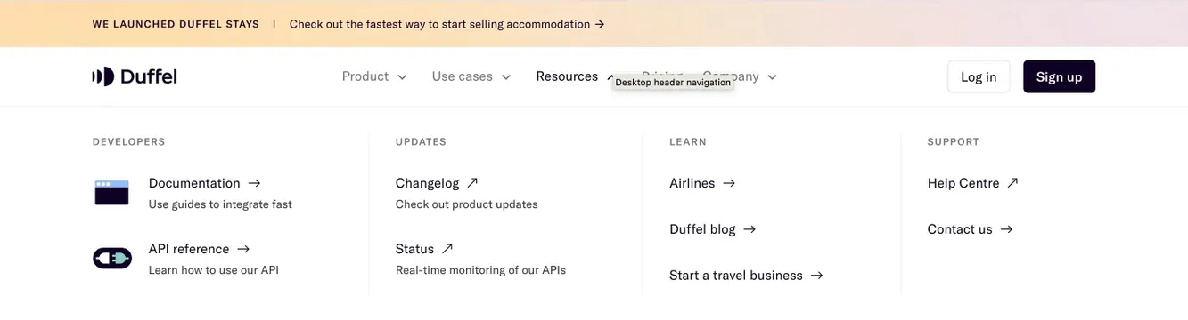
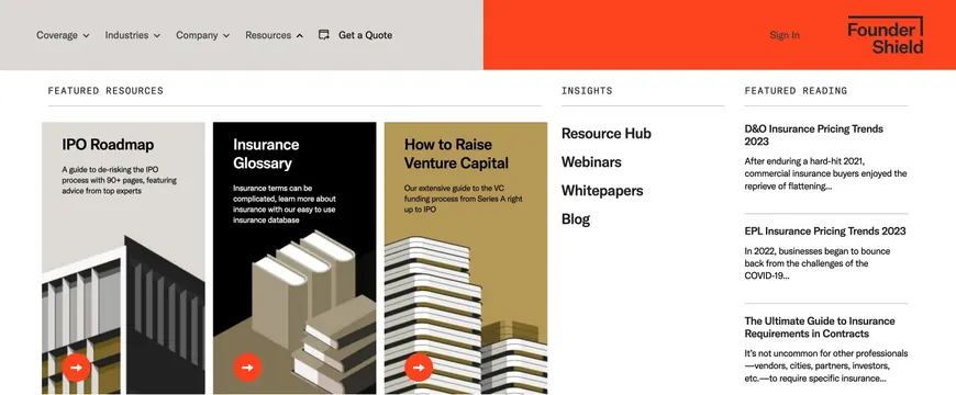
Resources dropdown mixing three tall featured guide cards, a simple insights link list, and featured article previews under the split-color navbar.
Summary
The Resources menu leads with three color-coded vertical guide cards, then balances a link column and featured article snippets in a structured three-column layout.
Visual description
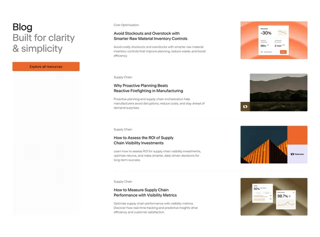
Resources shows an up chevron in the navbar. The white dropdown divides into three zones under small caps headers with thin rules. Left column FEATURED RESOURCES holds three tall cards: a light gray IPO Roadmap card with architectural line illustration and description about de-risking IPOs; a black Insurance Glossary card with white type and stacked-books illustration; a tan How to Raise Venture Capital card with skyscraper line art. Each card ends with a small orange circle containing a white right arrow. Middle column INSIGHTS lists bold black links: Resource Hub, Webinars, Whitepapers, Blog. Right column FEATURED READING shows three article blocks separated by horizontal rules, each with bold title and gray excerpt snippet for D&O Insurance Pricing Trends 2023, EPL Insurance Pricing Trends 2023, and The Ultimate Guide to Insurance Requirements in Contracts.
Key takeaway
Mixing promotional cards with plain link lists and live article previews gives content marketing equal weight inside navigation. Distinct card background colors plus line illustrations make guides feel like products, not footer links.
Reuse notes
Best for resource-heavy B2B brands with flagship guides and an active blog. Card column needs strong art direction; text-only teams should drop to two columns. Orange accent circles tie back to the navbar brand block for visual continuity.