Preview image. Unlock full-res
Light benefits section with oversized mixed-weight serif headline and a six-item grid of abstract navy-and-pink icon pairs.
Summary
A white benefits block leading with a large two-tone serif headline and a six-cell grid where each benefit pairs a small abstract icon with a title and one-line description.
Visual description
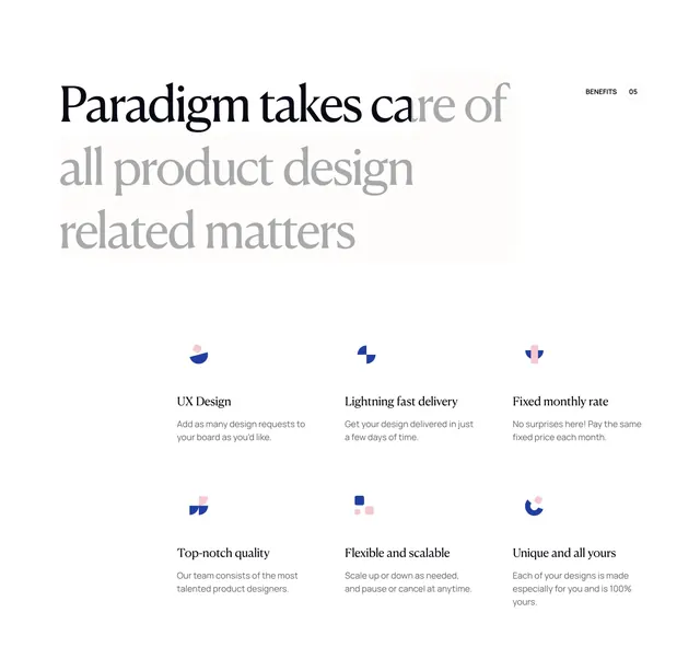
Solid white canvas with generous padding. Top left, an oversized left-aligned headline reads Paradigm takes care of in solid black, then all product design and related matters in lighter grey, with a soft beige rectangular highlight behind the grey lines. Top right, a small BENEFITS label and 05 inside a dashed circle act as a section index. Below, a two-row by three-column grid holds six benefit items: UX Design, Lightning fast delivery, Fixed monthly rate, Top-notch quality, Flexible and scalable, and Unique and all yours. Each cell stacks a tiny geometric icon in navy blue and soft pink, a bold serif title, and muted grey sans-serif body copy. Icons are abstract shapes (semicircles, squares, quarter-circles) rather than literal metaphors.
Key takeaway
The headline weight shift (black lead-in, grey continuation) plus a subtle background wash creates hierarchy without color noise. Consistent two-color micro-icons give six distinct benefits a unified brand language.
Reuse notes
Strong for design-agency or subscription-service landings that need credibility without product screenshots. Works on light backgrounds only; the serif headline needs room to breathe. Pair with a matching numbered section marker system used elsewhere on the page.