Preview image. Unlock full-res
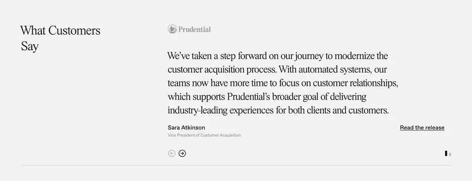
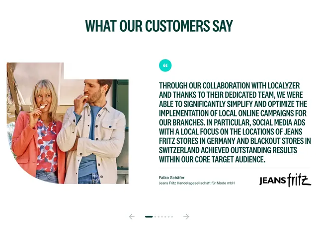
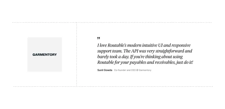
Minimal two-column testimonial with serif quote, client logo, attribution, release link, and carousel arrows on off-white.
Summary
An airy split testimonial section with a left serif heading, right-column Prudential logo and long quote, attribution row, and understated carousel navigation.
Visual description
Off-white background with generous whitespace. Narrow left column carries a black serif heading "What Customers Say" top-aligned. Wide right column opens with a medium-gray Prudential logo (Rock icon plus wordmark). Below, a large serif quote spans multiple lines about modernizing customer acquisition and freeing teams for relationships. Bottom row splits attribution on the left (bold sans name "Sara Atkinson," gray title "Vice President of Customer Acquisition") from an underlined "Read the release" link on the right. Bottom-left of the right column shows two circular arrow buttons: left arrow grayed out, right arrow active in black. A thin vertical progress indicator sits on the far right edge, implying a carousel.
Key takeaway
Letting the quote breathe at large serif size while the section label stays small creates editorial authority without a decorative card frame. Pairing attribution with a press-release link turns social proof into a credibility artifact.
Reuse notes
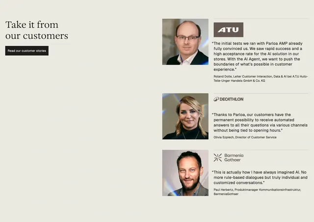
Use for enterprise B2B sites where one strong named quote beats a grid of short blurbs. Requires a recognizable client logo and a real release URL. Carousel controls stay minimal; works best with two to four testimonials total.
More testimonials sections
See all


More like this


Keep what you find
A free account saves references to boards and can send you a weekly email of picks based on what you save.
To see every result, go Pro.