Preview image. Unlock full-res
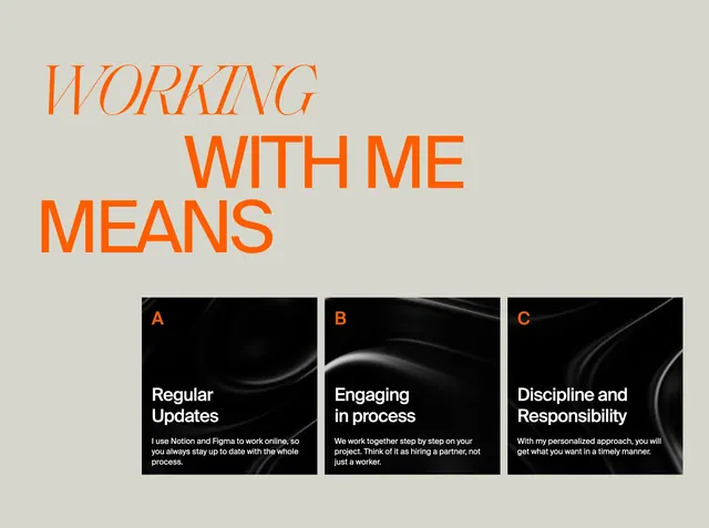
Light editorial section with oversized orange mixed-type headline and three letter-indexed dark cards explaining the collaboration process.
Summary
A spacious benefits section pairing a huge orange "WORKING WITH ME MEANS" headline with three dark square cards labeled A, B, and C that spell out how the designer collaborates.
Visual description
Warm off-white background with generous negative space above the content. The headline sits top-left: "WORKING" in large italic serif orange, "WITH ME" and "MEANS" in matching bold sans orange on separate lines. Below, three equal square cards span the width in a row. Each card has a near-black background with subtle flowing abstract texture, a small orange letter (A, B, C) in the corner, a white bold card title, and smaller white body copy. Titles read Regular Updates, Engaging in process, and Discipline and Responsibility.
Key takeaway
The letter-indexed card system turns process points into a memorable ABC rhythm. The dark textured cards against a pale field make three short paragraphs feel like premium objects rather than a bullet list.
Reuse notes
Strong for freelancer or studio sites explaining workflow without a timeline or icon row. Needs only three to four concise points; more cards will crowd the row. Pair with the same orange-and-cream type system used in the hero for cohesion.