Preview image. Unlock full-res
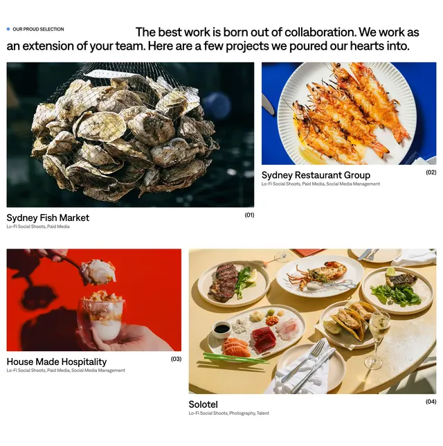
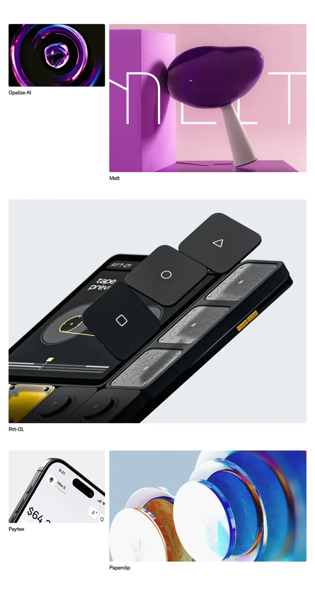
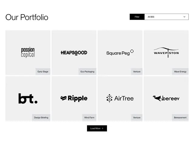
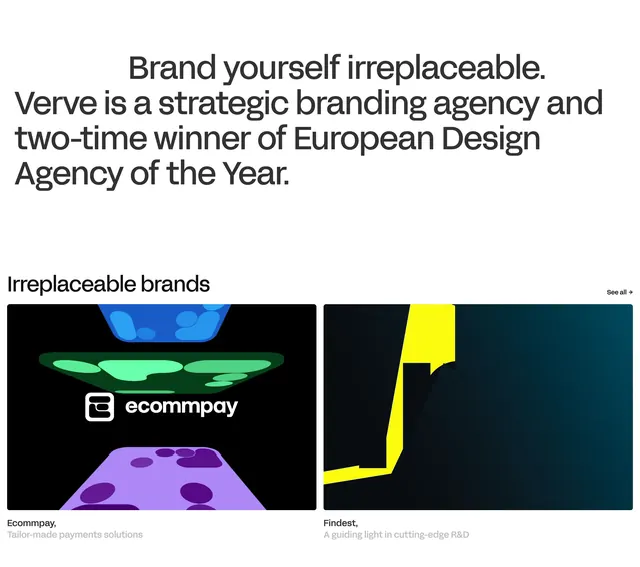
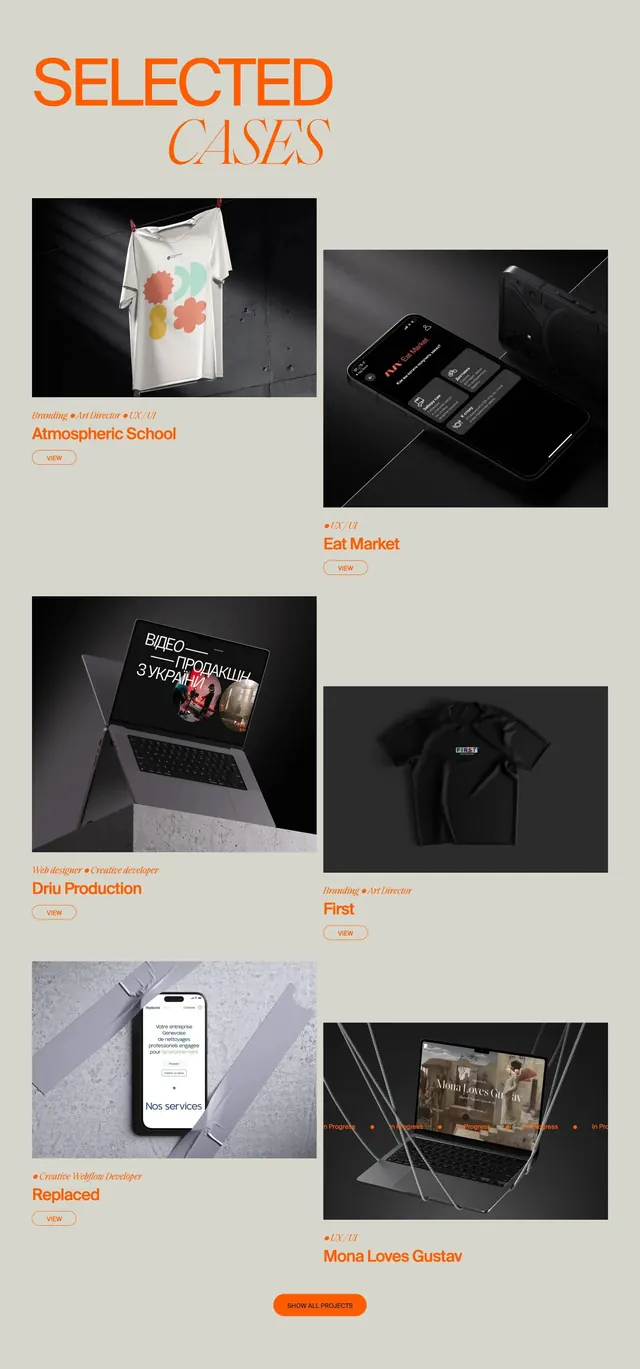
Minimal portfolio section with mixed-type "SELECTED CASES" headline, two-column staggered case-study cards on dramatic mockup photography, and a centered show-all CTA.
Summary
A curated works grid pairing editorial orange typography with six staggered project cards built on cinematic product mockup photos and small outlined VIEW pills.
Visual description
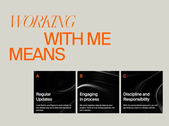
Same pale beige field as the rest of the Pash site. Top-left headline: "SELECTED" in bold orange sans, "CASES" in large italic serif orange offset below. Six portfolio items in two columns with vertical stagger so right-column cards sit lower than left. Each item: a square dramatic photo mockup (t-shirt on clothesline, phone on dark surface, laptop on concrete, flat-lay apparel, taped phone, suspended laptop), small orange role tags separated by bullets (Branding, Art Director, UX/UI, Web designer, Creative developer, etc.), a bold orange project title, and a small orange-outlined "VIEW" pill. Bottom center, a filled orange rounded "SHOW ALL PROJECTS" button with white text.
Key takeaway
Staggered two-column rhythm breaks the predictable portfolio grid without masonry complexity. Role tags above the title clarify scope in one line; the outlined VIEW pill keeps each card lightweight.
Reuse notes
Reference for agency or freelancer portfolio indexes that rely on photography rather than flat thumbnails. Every card needs a strong mockup image; weak assets will flatten the effect. Best with four to eight items before the show-all CTA.