Preview image. Unlock full-res
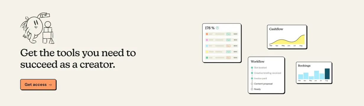
Split CTA band on cream with a hand-drawn mascot, serif headline, orange button, and a cluster of floating product UI cards.
Summary
A warm cream CTA section pairing a playful line-art mascot and serif pitch copy with a scattered collage of product dashboard cards on the right.
Visual description
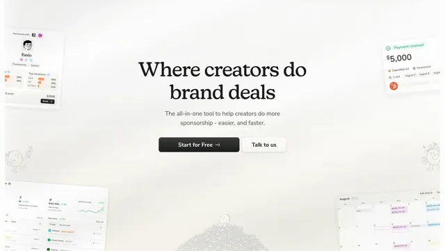
Light cream full-width band with a two-column layout. Left side shows a small black hand-drawn fruit mascot beside stacked blocks, a large black serif headline about tools for creators, and a peach-orange filled button with black border and slight offset shadow reading "Get access" with an arrow. Right side floats four white rounded cards at staggered angles with soft drop shadows: a revenue list with colored dots and Paid/Due status pills, a yellow area chart labeled Cashflow, a Workflow checklist with green checks and empty circles, and a Bookings bar chart with a highlighted August bar. Pastel accents inside the cards (yellow, blue, green, pink) sit against the neutral page background.
Key takeaway
Using miniature product UI cards as decorative proof instead of one flat screenshot: staggered, overlapping cards feel alive while staying on-brand. The hand-drawn mascot plus serif headline keeps a creator-facing CTA human without losing structure.
Reuse notes
Strong closing CTA for creator or marketplace about pages. Works when you have several small UI views to showcase. Needs consistent card styling and enough whitespace so the floating collage does not feel cluttered on smaller breakpoints.