Preview image. Unlock full-res
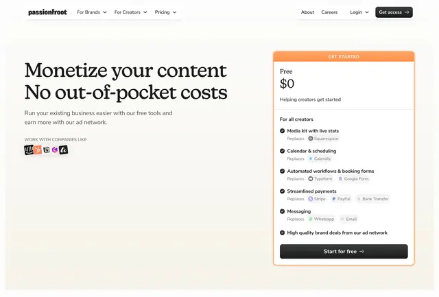
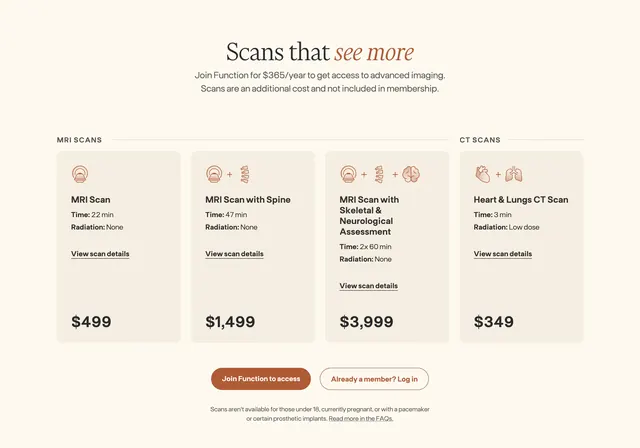
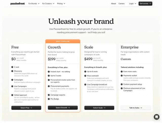
Cream-background pricing page with a serif headline and four equal pricing cards, one highlighted as most popular in orange.
Summary
A four-column pricing table on a warm cream page, pairing a large serif hero headline with tier cards that escalate from Free through Enterprise.
Visual description
Light cream full-width background with a top nav: lowercase wordmark left, dropdown links center-left, About/Careers/Login and a dark filled Get access button right. Below, a centered hero uses a large black serif headline and muted sans subcopy about free usage and enterprise procurement. Four white pricing cards sit in a row with equal height. Free, Scale, and Enterprise use plain white cards; Growth is wrapped in a thin orange border with a small orange MOST POPULAR pill at the top. Each card shows tier name, one-line description, price ($0, $199, $499, or Custom), a feature list with black check icons grouped under section labels like Discovery and Campaigns, and a bottom CTA button (black filled for paid tiers, outlined Talk to Sales on Enterprise). Typography mixes serif display for the page title and clean sans for card content.
Key takeaway
The restrained cream palette that lets a single orange accent carry all emphasis on the recommended tier. Serif-plus-sans pairing gives editorial weight to the headline without complicating the scannable card grid.
Reuse notes
Strong pattern for B2B SaaS with a generous free tier and clear upgrade ladder. Works when you have four distinct plans and want one tier visually nominated without loud gradients. Needs concise feature copy; long lists will crowd the equal-height cards.