Preview image. Unlock full-res
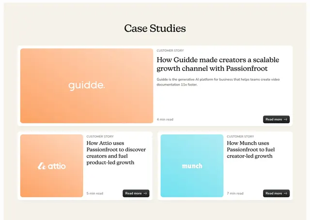
Case Studies section with one featured full-width story card above two smaller cards, each pairing a gradient logo tile with serif headlines and Read more CTAs.
Summary
A three-card case study grid on cream background: one wide featured story on top and two equal cards below, each with a diagonal gradient logo block and a black Read more button.
Visual description
Light cream section with a centered black serif Case Studies heading. Top row is a full-width white card with rounded corners and a soft shadow. Left half is a large orange-to-peach diagonal gradient tile with the white guidde. wordmark centered. Right half shows a small gray CUSTOMER STORY label, a bold serif headline about scalable creator growth, a muted sans description of Guidde as a generative AI platform, a 4 min read timestamp, and a black rounded Read more button with arrow. Bottom row splits into two equal cards with the same white-card treatment. Attio uses an orange gradient square with its logo; Munch uses a light blue-to-cyan gradient square. Both smaller cards carry CUSTOMER STORY labels, serif headlines, read times (5 min and 7 min), and matching Read more buttons. Typography alternates serif display for headlines and clean sans for metadata.
Key takeaway
The bento rhythm of one hero story plus two supporting cards keeps hierarchy clear without a carousel. Gradient logo tiles give each brand a distinct color moment while keeping card interiors structurally identical.
Reuse notes
Good for B2B SaaS social proof when you have three strong customer narratives. Requires quality partner logos and concise headlines; the featured card needs a longer description to fill the wide layout. Gradient colors can vary per brand without breaking the pattern.