Preview image. Unlock full-res
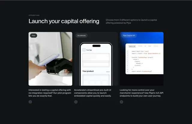
Dark integrations section presenting Pilot, Accelerate, and Pipe Capital API as three cards with photo, UI mockup, and code editor visuals.
Summary
A partner-page integrations block on black that introduces three launch paths for embedded capital, each in its own tall card with distinct visual proof and a plus icon footer affordance.
Visual description
Black background. Header row: INTEGRATIONS in small gray caps, large white Launch your capital offering headline left, gray subcopy about three options right. Three equal dark rounded cards follow. Left Pilot card: gray pill badge, photo of a hand holding a phone near a card terminal, paragraph about testing with no integration, plus circle bottom-right. Middle Accelerate card: badge, stylized phone UI with Your App and Your product placeholders, copy about pre-built UI components, plus icon. Right Pipe Capital API card: blue badge, code window on blue gradient with Typescript, Python, Go, Rust, Elixir tabs and React PipeUI snippet, copy about API control, plus icon.
Key takeaway
Mapping integration depth to visual language (real-world photo, product shell, code) helps technical buyers self-segment instantly. Pill badges name the tier before the user reads body copy. Identical card chrome with different hero media keeps the comparison fair.
Reuse notes
Ideal for platform or API products offering good-better-best implementation paths. Requires one photo, one UI schematic, and a credible code sample. Works on dark partner pages; the API card's blue gradient is the main accent.