Preview image. Unlock full-res
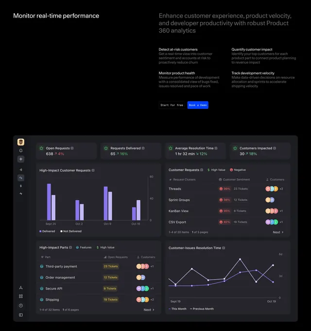
Dark two-column feature section with a left/right header split over a four-quadrant analytics dashboard mockup full of charts, tables, and metric cards.
Summary
A dark feature-detail section that splits a short left headline from a right-hand block of four sub-features, then presents a large, fully realized analytics dashboard mockup beneath. The data-dense dashboard image carrying the lower two-thirds is the defining element.
Visual description
Near-black background. The header is a two-column split: a white headline ("Monitor real-time performance") on the left and, on the right, a larger grey statement plus a two-by-two set of bolded sub-feature titles each with a line of muted copy (detect at-risk customers, monitor product health, quantify customer impact, track development velocity). A monospace "Start for free" button and a blue "Book a Demo" button sit between them. Below spans a wide dark dashboard mockup arranged in four quadrants: top-row metric cards with trend percentages, a purple bar chart of customer requests, a sentiment table with colored tags and avatar stacks, a high-impact parts table, and a line chart of resolution time, all with a slim left icon rail.
Key takeaway
Letting a realistic, data-dense dashboard mockup occupy most of the section sells an analytics product more convincingly than abstract graphics. The header trick of pairing one short headline with a four-item sub-feature grid packs four value props above the visual without clutter.
Reuse notes
Best when the product genuinely is a dashboard and you have a polished, populated UI to show. The mockup must look real and legible, since blurry or fake-looking data would undercut the whole section. Heavy on screen real estate, so it suits a desktop-first analytics or observability page. Works on dark.