Preview image. Unlock full-res
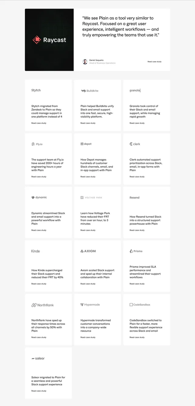
Light case-study index with a featured Raycast hero card and a three-column grid of logo-led customer stories with read links.
Summary
A customers page case-study section leading with a wide Raycast feature card, then a dense grid of white tiles each showing a customer logo, one-line outcome summary, and Read case study link.
Visual description
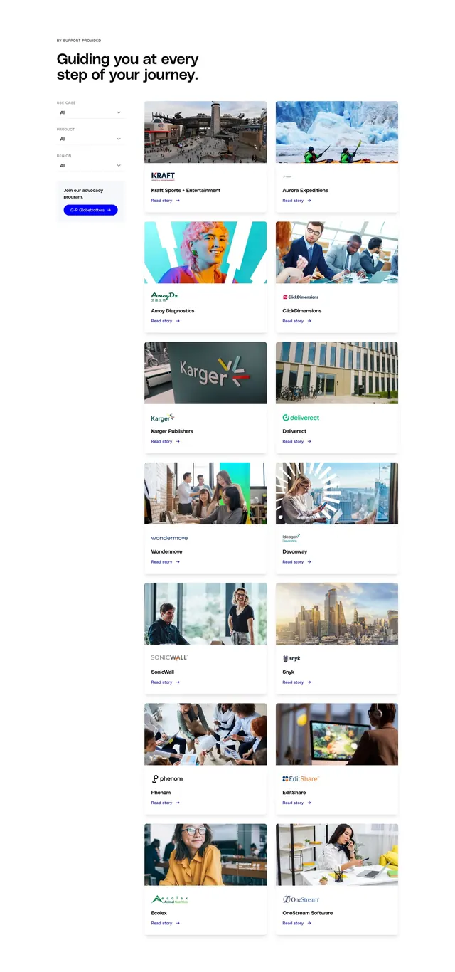
Light gray page background. Top featured horizontal card split: left dark textured panel with red Raycast logo and wordmark on dot pattern; right white panel with quote comparing Plain to Raycast's focus on UX and intelligent workflows, circular headshot of Daniel Sequeira with Head of Business Operations title, and Read case study link bottom-right. Below, a three-column grid of sixteen smaller white cards with consistent padding. Each tile shows a monochrome company logo (Stytch, Buildkite, granola, Fly.io, depot, clerk, dynamic, VOLTAGE PARK, Resend, Kinde, AXIOM, Prisma, Northflank, Hypermode, CodeSandbox, saleor), two-line gray summary of migration or support outcome, and Read case study text link at the bottom.
Key takeaway
One hero case study with quote and portrait elevates social proof above a scannable logo grid of shorter stories. Monochrome logos in the grid keep visual noise low while brand names stay recognizable. One-line outcome copy per tile makes the grid browsable without opening every PDF.
Reuse notes
Strong for B2B SaaS customers pages with many logos and deeper case studies behind links. Needs one flagship customer willing to give a quote and photo. Grid density works on desktop; plan for two-column or stacked cards on smaller screens.