Preview image. Unlock full-res
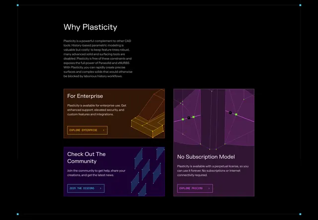
Dark bento grid with enterprise, community, and no-subscription cards each using wireframe 3D art and ghost CTAs.
Summary
A "Why Plasticity" bento section with left intro copy and three gradient cards for enterprise, community Discord, and perpetual licensing.
Visual description
Black background. Top left: white "Why Plasticity" heading and gray paragraph positioning Plasticity as a Parasolid/xNURBS complement without history-tree workflows. Below, asymmetric card grid: top-left orange-brown card "For Enterprise" with orange wireframe mechanical part, enterprise support copy, and orange "EXPLORE ENTERPRISE >" ghost button; bottom-left navy card "Check Out The Community" with floating blue translucent planes, Discord join copy, and blue ghost button; tall right purple card spanning both rows with purple wireframe model and neon green control points, "No Subscription Model" copy on perpetual license, and purple "EXPLORE PRICING >" button at bottom.
Key takeaway
Bento asymmetry lets one pricing message dominate visually while enterprise and community stay peer-sized. Each card color matches its wireframe illustration for instant category recognition. Ghost buttons with chevrons keep CTAs visible without solid-button noise.
Reuse notes
Strong for "why us" blocks on pro-tool sites. Three cards with distinct color stories need disciplined palette control. Tall card requires enough copy to justify height or it feels empty.