Preview image. Unlock full-res
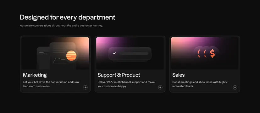
Dark three-column feature grid where each card pairs a glowing gradient illustration tile with a department label and expand control.
Summary
A dark three-column features section that splits a product by department, each card topped with a glowing gradient illustration tile. The defining move is the warm pink-to-orange glow inside otherwise black cards, lighting each feature from within.
Visual description
On a near-black background, a left-aligned oversized white headline "Designed for every department" sits above a single line of muted grey subcopy. Three large dark cards run in equal columns, each split into an upper illustration panel and a lower text block. The upper panels carry abstract UI illustrations lit by colored glows: a chat/message mock with a warm amber orb (Marketing), a single checkmark and bar on a magenta-to-violet gradient (Support & Product), and overlapping circular dollar-sign icons on a pink-violet gradient (Sales). Below each illustration is a bold white label (Marketing, Support & Product, Sales), a line of grey description, and a small circular plus icon in the bottom-right corner. Card borders are barely visible against the black ground.
Key takeaway
Organizing features by department on near-black cards, each carrying its own colored gradient glow so the three otherwise-similar cards stay visually distinct. The corner plus icon signals each card expands, adding depth without cluttering the closed state.
Reuse notes
Good when one product serves several teams and you want to address each by name. The internal glows are the signature, so keep illustrations dark with a single colored light source per card. The plus icons imply expandable detail, so wire up the interaction. Works only on dark backgrounds and wants three to four cards before the row feels crowded.