Preview image. Unlock full-res
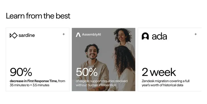
Three-column case study row with Learn from the best headline and cards showing large outcome metrics for Sardine, AssemblyAI, and Ada.
Summary
Customer proof section with three equal cards highlighting 90% FRT reduction, 50% AI deflection, and a two-week Zendesk migration, each with company logo and plus icon.
Visual description
Left-aligned bold headline Learn from the best above three rectangular cards. Left white card: sardine logo, plus icon top right, oversized 90%, copy on First Response Time drop from 35 minutes to under 3.5 minutes. Center card uses a darkened team photo background with white AssemblyAI logo, 50%, and copy about eligible inquiries resolved without human intervention. Right white card: ada logo, 2 week metric, Zendesk migration covering a full year of historical data. Each card has a small plus in the corner suggesting expand or link.
Key takeaway
Leading with one giant number per customer makes outcomes scannable in a grid. Mixing one photo-backed card among white cards adds warmth without breaking rhythm. Plus icons hint interactivity while keeping the row visually quiet.
Reuse notes
Strong for B2B SaaS social proof when metrics are verified. Photo card needs sufficient contrast for white type. Three cards is the sweet spot; more dilutes impact.
More testimonials sections
See all

More like this

Keep what you find
A free account saves references to boards and can send you a weekly email of picks based on what you save.
To see every result, go Pro.