Preview image. Unlock full-res
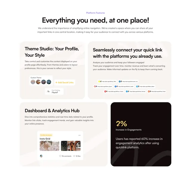
Centered-intro features section laid out as a four-tile bento, three light cards with mini mockups and one dark card holding a big stat.
Summary
A features section using a four-tile bento where three light beige cards carry feature copy with small UI mockups and the fourth is a dark card built around one large statistic. The off-grid dark tile is the focal accent.
Visual description
A centered intro stacks a small purple "Platform Features" eyebrow, a bold headline "Everything you need, at one place!", and two lines of grey sub-copy. Below, a 2x2 bento of rounded tiles: top-left ("Theme Studio: Your Profile, Your Style") with a small custom-theme/avatar-swatch mockup; top-right ("Seamlessly connect your quick link with the platforms you already use") with a grid of social-link chips; bottom-left ("Dashboard & Analytics Hub") with an "Insta Grid / Profile Analysis" mini card showing photos and engagement counts; bottom-right a dark, near-black tile holding a gold "2%" figure, an "Increase in Engagements" label, and a short paragraph claiming a 60% engagement lift. Cards sit on a warm off-white background with faint oversized line graphics behind.
Key takeaway
The single dark, high-contrast tile inside an otherwise light bento to pull the eye to the headline metric. Embedding a small, plausible product mockup in each feature card so the grid shows the product rather than just listing benefits. The warm beige card fills keep the layout soft while still reading as structured.
Reuse notes
Works for products with three to four distinct feature pillars, especially link-in-bio, creator, or profile tools. The dark stat tile needs a genuinely strong number to justify the contrast; a weak figure there backfires. The bento scales to larger grids, and the light/one-dark pattern is reusable any time one tile deserves to dominate.