Preview image. Unlock full-res
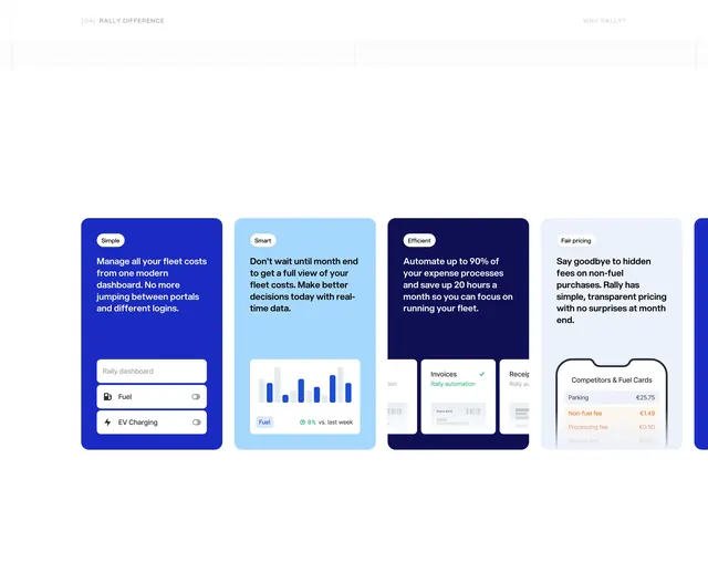
A horizontal row of tall color-blocked cards (Simple, Smart, Efficient, Fair pricing) each pairing copy with a UI vignette.
Summary
Four saturated feature cards in a horizontal strip, each tagged with a one-word pillar and illustrated by a small product UI snippet at the bottom.
Visual description
White page with subtle diagonal grid at top. Header: "[04] RALLY DIFFERENCE" left, "WHY RALLY?" right in light gray. Four rounded vertical cards sit side by side (a fifth partially visible): (1) medium blue "Simple" card with white copy and a dashboard toggle mock showing Fuel and EV Charging switches; (2) sky blue "Smart" card with bar chart and "+8% vs. last week" stat; (3) navy "Efficient" card with overlapping invoice cards and green checkmark on "Rally automation"; (4) pale blue-gray "Fair pricing" card with phone mock listing competitor hidden fees in orange. Each card has a white pill tag with black label at top-left.
Key takeaway
One-word pillar tags plus color blocking to differentiate benefits without four identical layouts. UI vignettes at the card foot prove the claim instead of stock icons alone.
Reuse notes
Works for products with 3-5 distinct value props. Horizontal scroll suits mobile; ensure card height stays consistent. Color palette must stay harmonious across blocks or the strip feels chaotic.