Preview image. Unlock full-res
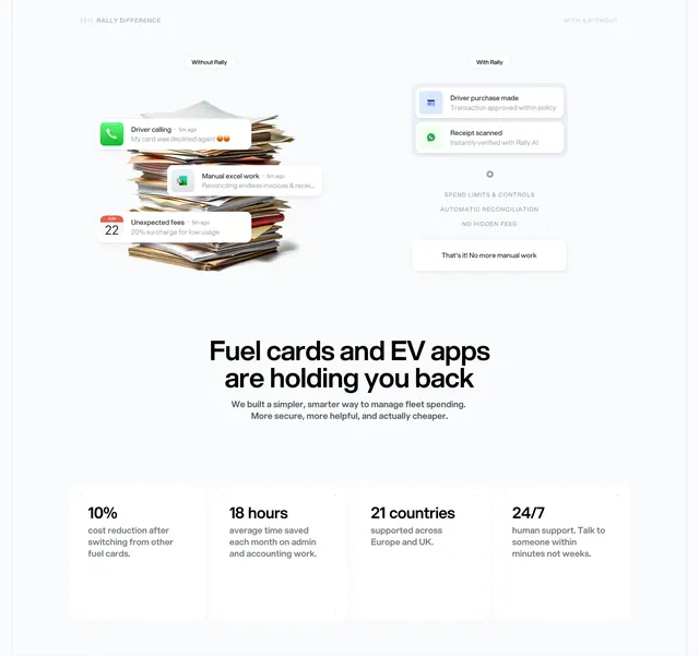
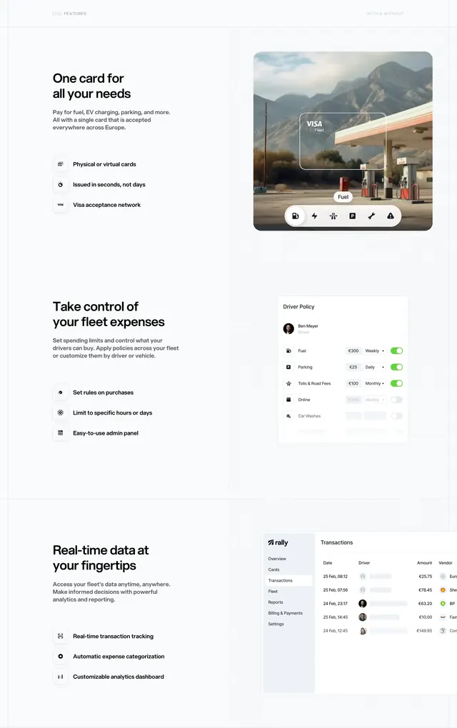
A before-and-after comparison with notification cards, a bold problem headline, and a four-column stats row on savings and support.
Summary
A three-part section: emotional with/without cards at top, a provocative headline in the middle, and four KPI tiles quantifying savings, time, geography, and support at the bottom.
Visual description
Top: two-column "Without Rally" vs "With Rally" comparison. Left shows messy paper stack with floating alert cards (declined card with emoji, Excel reconciliation, unexpected fees on calendar). Right shows tidy digital cards (approved transaction, AI-verified receipt), faint caps labels (SPEND LIMITS & CONTROLS, AUTOMATIC RECONCILIATION, NO HIDDEN FEES), and white pill "That's it! No more manual work." Middle: large headline "Fuel cards and EV apps are holding you back" with subcopy on a simpler fleet spending alternative. Bottom: four white rounded stat cards reading "10% cost reduction", "18 hours saved", "21 countries supported", and "24/7 human support" each with explanatory gray text below.
Key takeaway
Stacking emotional contrast, narrative reframing, and hard numbers in one scroll sequence so persuasion moves from feeling to logic. The notification-card vocabulary stays consistent across the comparison and product UI elsewhere.
Reuse notes
Ideal for category-replacement stories (legacy tools vs modern platform). Stats must be defensible. The emoji in the "declined card" alert adds personality but may not suit every brand tone.
More comparison sections
See all











More like this



Keep what you find
A free account saves references to boards and can send you a weekly email of picks based on what you save.
To see every result, go Pro.