Preview image. Unlock full-res
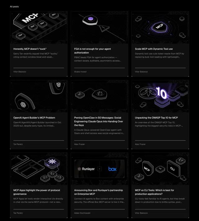
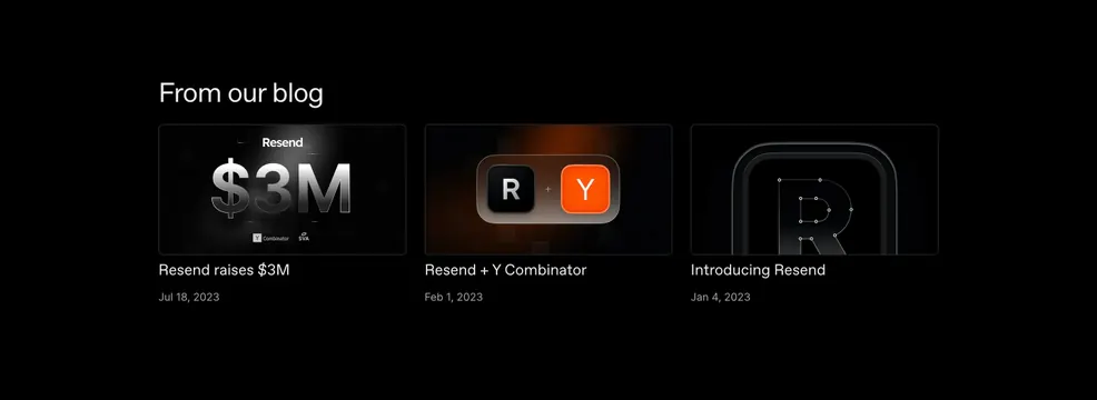
Dark three-column blog section with a left-aligned From our blog heading and cards showing OG-style thumbnails, titles, and dates.
Summary
Dark three-column blog section with a left-aligned From our blog heading and cards showing OG-style thumbnails, titles, and dates.
Visual description
Solid black section with a white left-aligned heading From our blog above a horizontal row of three equal cards. Each card stacks a large dark thumbnail with thin grey border, white post title, and small muted grey date. Thumbnails use abstract branded graphics: a glowing 3M fundraising render with Y Combinator and SV Angel logos, a warm orange Resend plus YC icon pairing, and a blueprint-style R logo with concentric rounded frames.
Key takeaway
Treating blog cards like social OG art turns a simple list into a visual brand gallery. Keeping titles and dates minimal lets the thumbnail carry recognition.
Reuse notes
Strong for developer-tool about pages highlighting company milestones. Requires consistently art-directed post images; generic stock photos would break the effect. Best with three or six items in a clean grid.