Preview image. Unlock full-res
Dark three-column benefits section with gradient-accent headline, UI vignette cards, and copy positioning Relume Ipsum against Lorem Ipsum.
Summary
Dark three-column benefits section with gradient-accent headline, UI vignette cards, and copy positioning Relume Ipsum against Lorem Ipsum.
Visual description
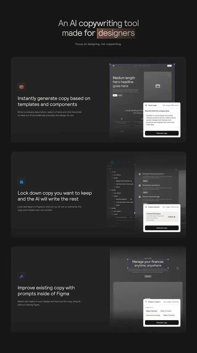
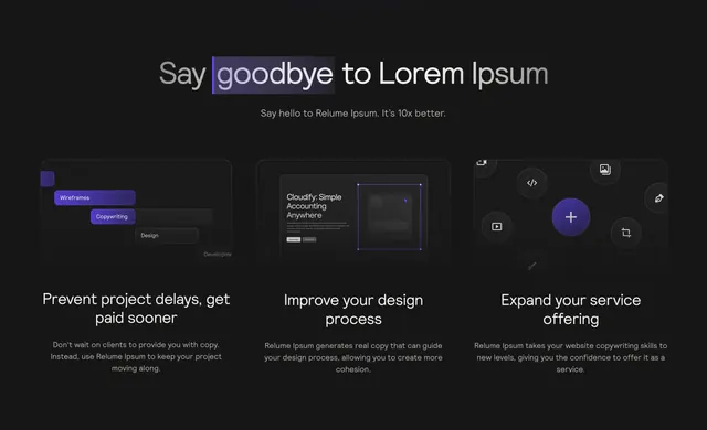
Charcoal background with centered header: Say goodbye to Lorem Ipsum where goodbye sits on a purple-to-blue gradient pill, plus subhead Say hello to Relume Ipsum. It's 10x better. Below, three equal columns each hold a rounded dark card with a stylized UI vignette, white benefit title, and gray body copy. Left card shows stacked workflow pills labeled Wireframes, Copywriting, Design, Development. Center card shows a landing-page mockup with Cloudify headline and a purple-outlined placeholder block. Right card shows floating tool icons around a gradient plus circle on a grainy dark field. Titles read Prevent project delays, get paid sooner; Improve your design process; Expand your service offering.
Key takeaway
Replace abstract benefit icons with miniature product UI scenes that prove the workflow. The gradient-highlighted verb in the headline makes the positioning line scannable without oversized type.
Reuse notes
Works for designer-facing SaaS or plugin landing pages on dark backgrounds. Each column needs one concrete UI story; keep body copy to two lines. Purple-blue gradient accents should stay consistent across cards.