Preview image. Unlock full-res
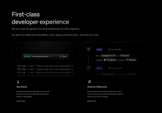
Two-column feature section with product UI mockups above icon-led Test Mode and Modular Webhooks cards.
Summary
Two-column feature section with product UI mockups above icon-led Test Mode and Modular Webhooks cards.
Visual description
Black background opens with a left-aligned white headline First-class developer experience and two lines of gray body copy with one italic phrase. Below, two equal cards sit side by side. Each card top half shows a dark UI mockup in a rounded frame: left card simulates a test send form with green Delivered badge and monospace HTTP 200 JSON responses; right card shows a vertical webhook event timeline with purple Clicked and blue Opened tags, timestamps, and pill metadata rows with small OS and client icons. Under each mockup, a white line icon, bold feature title, gray description, and Learn more text link.
Key takeaway
Leading with realistic in-product UI above the feature title sells capability faster than icon bullets alone. Status-colored event tags in the webhook timeline make abstract backend behavior scannable at a glance.
Reuse notes
Ideal for API or infrastructure products targeting engineers. Each card follows the same mockup-then-copy pattern so you can repeat for a longer feature grid. Mockups need legible monospace detail; avoid shrinking below readable code size.