Preview image. Unlock full-res
Dark split integrations section with two categorized logo lists and hairline row dividers.
Summary
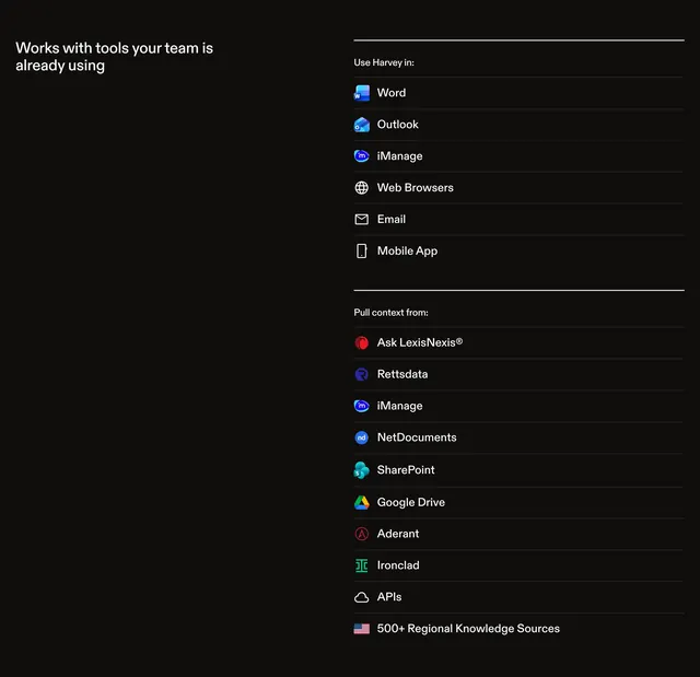
A dark integrations directory with a left heading and two right-column lists of tools, each row pairing a brand icon with a name and hairline separator.
Visual description
Solid black background in a two-column layout. Left column shows the white sans-serif heading "Works with tools your team is already using." Right column contains two labeled groups: "Use Harvey in:" (Word, Outlook, iManage, Web Browsers, Email, Mobile App) and "Pull context from:" (LexisNexis, Rettsdata, iManage, NetDocuments, SharePoint, Google Drive, Aderant, Ironclad, APIs, 500+ Regional Knowledge Sources). Each row has a small icon, white label, and thin horizontal divider; group labels are smaller gray text.
Key takeaway
Table-like integration lists feel more enterprise-credible than a logo cloud when tools have long tails. Mixing full-color brand marks with simple wireframe icons keeps generic categories readable.
Reuse notes
Use for workflow products where integration breadth is the sell. Long lists need consistent icon sizing; ragged logos will break the grid rhythm.