Preview image. Unlock full-res
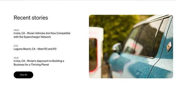
Light editorial block pairing a dated story list and View All CTA with a large rounded feature photo.
Summary
Light editorial block pairing a dated story list and View All CTA with a large rounded feature photo.
Visual description
White background with a two-column split. Left column leads with a large black Recent stories heading, then three stacked entries each showing a small date stamp and a single-line headline (Supercharger compatibility, R2 and R3 reveal, sustainability approach). A black pill View All button sits below the list. Right column is a large photograph with heavy corner rounding: a teal Rivian vehicle close-up covered in rain droplets, yellow compass badge on the body, blurred Supercharger and greenery in the background tying to the lead story.
Key takeaway
Pairing a minimal text index with one evocative photo that visually echoes the top headline, so the section reads as editorial rather than a card grid. Date-before-headline formatting adds newsroom credibility without metadata clutter.
Reuse notes
Good homepage stories module for brands with infrequent but high-quality announcements. The single hero image approach scales better than a three-card grid when stories are text-forward. Needs strong photography that relates to the lead item.