Preview image. Unlock full-res
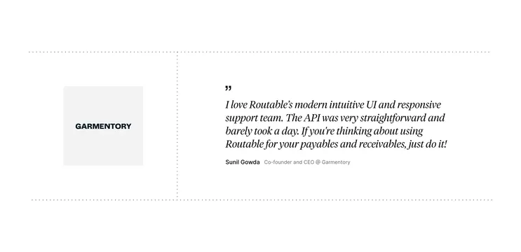
Minimal light testimonial block with dotted-line grid framing a customer logo left and a large italic serif quote right.
Summary
Minimal light testimonial block with dotted-line grid framing a customer logo left and a large italic serif quote right.
Visual description
White background section bounded by thin dotted horizontal rules at top and bottom, with a vertical dotted rule splitting the layout roughly one-third left and two-thirds right. Left column centers a light gray square tile with the Garmentory wordmark in bold black caps. Right column opens with a small black quotation mark, then a large italic serif quote praising Routable's UI, support, and API. Attribution below reads Sunil Gowda in bold sans, with Co-founder and CEO @ Garmentory in smaller gray sans.
Key takeaway
Dotted construction lines replace heavy borders and give a Swiss editorial feel with almost no chrome. Pairing a neutral logo tile with oversized italic quote type creates clear hierarchy between brand proof and voice. The quote icon stays small so the typography carries the section.
Reuse notes
Use for a single flagship customer story on a product or payments landing page when you want restraint over carousel noise. Needs a recognizable logo and a quote long enough to justify large type. Dotted grid may feel sparse if surrounding sections are also very minimal.
More testimonials sections
See all



More like this






Keep what you find
A free account saves references to boards and can send you a weekly email of picks based on what you save.
To see every result, go Pro.