Preview image. Unlock full-res
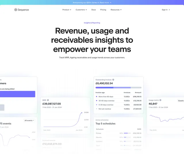
Product hero with purple category label, centered headline, and overlapping analytics dashboard cards on a grid.
Summary
Product hero with purple category label, centered headline, and overlapping analytics dashboard cards on a grid.
Visual description
Sequence nav and Series A bar above purple Insights and Reporting label, centered headline Revenue, usage and receivables insights to empower your teams, and gray subcopy about MRR and ageing receivables. Lower half shows overlapping white dashboard cards on a pale grid: MRR line chart at 39M GBP, outstanding invoices bar and aging table, usage line chart, top schedules table, and partial invoiced revenue and events widgets with purple and blue chart accents.
Key takeaway
Bento collage of real metric cards sells reporting depth faster than one screenshot. Purple category label matches other Sequence product subpages for wayfinding.
Reuse notes
Analytics or finance product heroes where data density is the value prop. Cards need legible numbers at marketing scale; overlap should stay shallow.