Preview image. Unlock full-res
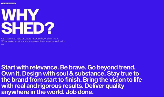
Full-bleed royal blue section with WHY SHED headline and bold sans values mantra about relevance, bravery, and rigorous results.
Summary
A saturated blue full-width block presenting WHY SHED in oversized white type with a multi-line agency values mantra below.
Visual description
Solid royal blue background with white THE SHED APPROACH pill top left. Massive white sans WHY SHED headline stacked on two lines. Small white serif intro about purposeful original work. Bottom left holds a larger bold sans paragraph listing values: start with relevance, be brave, go beyond trend, own it, design with soul, stay true to brand, bring vision to life, deliver quality globally, job done.
Key takeaway
Single-color field with oversized question headline makes culture content feel editorial not corporate. Mixing serif intro with bold sans manifesto creates hierarchy in one column. Values as flowing sentences read human versus bullet cliches.
Reuse notes
Culture or about modules for creative agencies with a strong brand color. Blue field needs sufficient contrast for white text. Long manifesto may truncate on mobile with read-more pattern.