Preview image. Unlock full-res
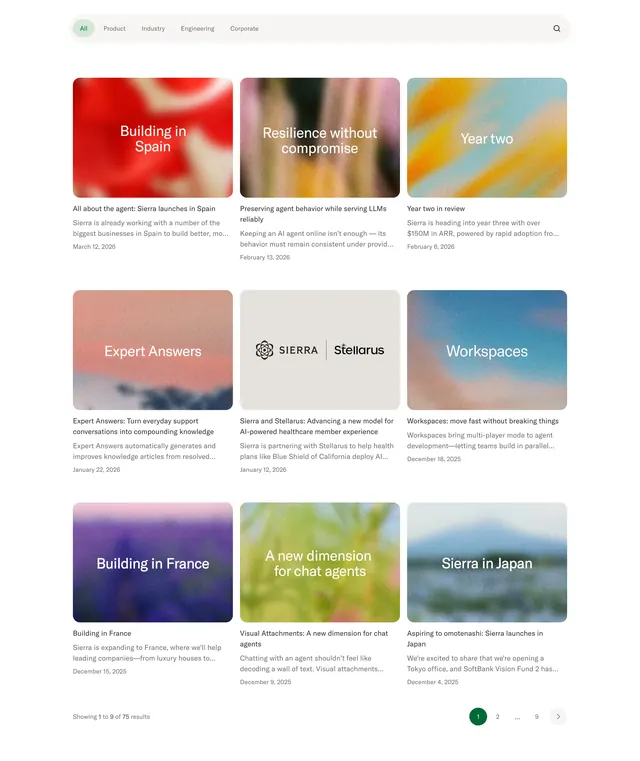
Filterable blog index with category pill tabs, a 3x3 card grid of gradient thumbnails with overlay titles, and numbered pagination showing 75 results.
Summary
A company news index with horizontal category filters, nine article cards using abstract gradient hero images, and bottom pagination.
Visual description
Light grey background with a rounded filter bar: All active in green, plus Product, Industry, Engineering, Corporate, and a search icon. Nine cards in a three-column grid each have a rounded gradient or textured thumbnail with large white overlay text like Building in Spain or Sierra in Japan, bold black title, grey excerpt, and date. One card uses a neutral grey background with SIERRA and Stellarus logos instead of gradient art. Footer shows Showing 1 to 9 of 75 results and circular pagination with page 1 highlighted in dark green.
Key takeaway
Abstract gradient thumbnails with oversized overlay type give a consistent visual system without photography per post. Category pill filters keep a large archive browsable from one page. Pagination with result count sets expectations for depth of content.
Reuse notes
Works for company blogs or newsrooms with frequent publishing. Needs either strong abstract art direction or photography per card; mixed styles can feel inconsistent. Filter bar scales to four to six categories before wrapping awkwardly.