Preview image. Unlock full-res
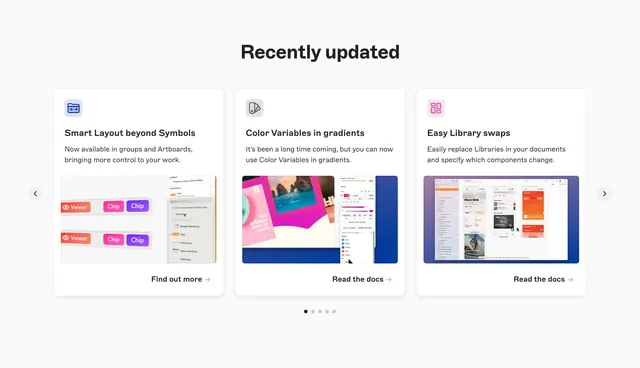
Horizontal product update carousel with three feature cards showing icons, descriptions, UI previews, and doc links under a Recently updated heading.
Summary
Horizontal product update carousel with three feature cards showing icons, descriptions, UI previews, and doc links under a Recently updated heading.
Visual description
Light grey background with centered Recently updated headline. Three white rounded cards in a row: Smart Layout beyond Symbols with blue folder icon and layout UI preview, Color Variables in gradients with swatch icon and gradient picker screenshot, Easy Library swaps with pink grid icon and library swap modal screenshot. Each card has title, short description, product image, and Find out more or Read the docs link. Chevron arrows flank the row with five pagination dots below.
Key takeaway
Uniform card template makes changelog items feel consistent release over release. UI screenshot per card proves the feature without opening docs. Carousel keeps a busy release cadence manageable above the fold.
Reuse notes
Good for design or dev tools with frequent shipping news. Needs fresh screenshots per release; stale UI undermines trust. Three visible cards is the practical maximum before peek feels cramped.