Preview image. Unlock full-res
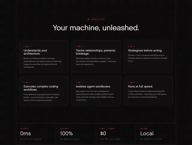
Dark developer-tool feature grid with a sticky intro column and eight icon-led cells holding small technical illustrations.
Summary
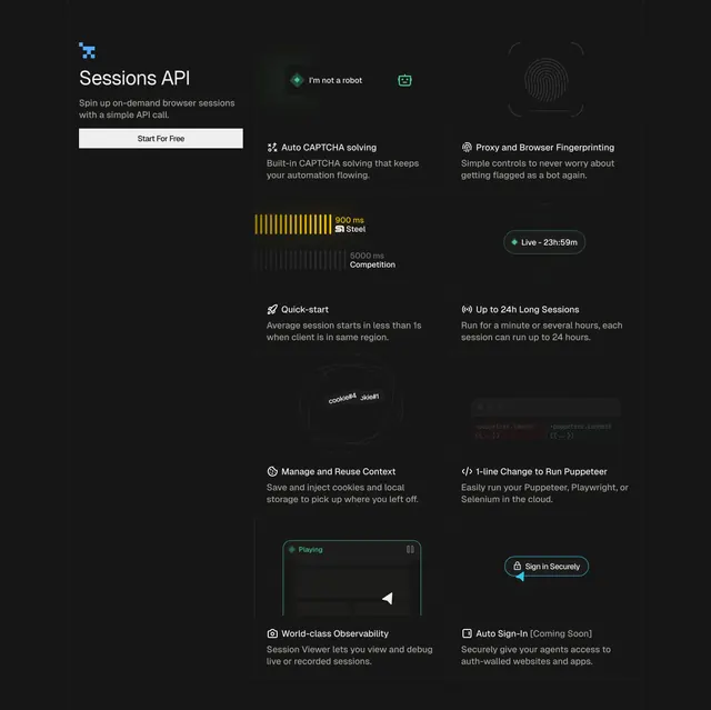
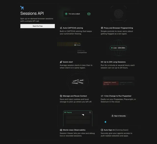
A dark feature section for a browser-infrastructure API, with a sticky left intro column and a two-column grid of eight icon-led cells. Each cell pairs a small abstract technical visual with an icon, title, and one line of copy.
Visual description
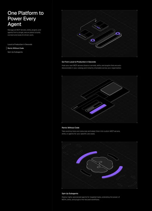
The left column holds a logo, the section title "Sessions API," a one-line description, and a white "Start For Free" button; it stays fixed while the grid scrolls. To the right, eight feature cells are divided by thin hairline borders into two columns. Each top half shows a small monochrome graphic (an "I'm not a robot" CAPTCHA chip, a fingerprint, a latency comparison readout, a globe with a live session timer, a cookie/context cluster, a Puppeteer code snippet, a session-viewer player, a sign-in glyph). Below each graphic sits a green-accented icon, a bold title, and grey supporting copy. The palette is near-black with a single green accent.
Key takeaway
The sticky intro column against a scrolling feature grid keeps context pinned while the reader moves through capabilities. Each cell gets its own tiny purpose-built illustration rather than a generic icon, which makes an eight-item grid feel considered. A single green accent disciplines the whole dark layout.
Reuse notes
Ideal for developer tools and infrastructure products with many discrete capabilities to enumerate. The custom per-cell graphics are the cost of entry; a lazy icon set would make this fall flat. The sticky column needs enough viewport height to be worth the technique.