Preview image. Unlock full-res
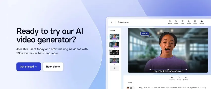
Light split CTA on a soft blue gradient, left copy with two buttons beside a large AI-video-editor product mockup.
Summary
A light split CTA on a soft blue-to-lavender gradient, pairing a left-aligned headline and dual buttons with a large mockup of the AI video editor. The product shot does the persuading while the copy stays short.
Visual description
The left half holds a two-line dark headline "Ready to try our AI video generator?", a one-sentence subhead citing 1M+ users and 230+ avatars, then a filled blue "Get started" button and a white "Book demo" button. The right half shows a large rounded product mockup of the video editor: a top toolbar (Avatar, Space, Text, Shape, Media, Record), a left scene-list rail, and a main canvas with an avatar speaking in an office setting, captioned subtitles, and a script panel below. The whole section sits on a pale blue gradient that shifts to lavender at the top right.
Key takeaway
Closing with a working editor mockup instead of a flat banner lets the final CTA double as a last product demo. The soft gradient keeps the section light and inviting rather than a hard color block. Dual buttons split self-serve ("Get started") from sales ("Book demo") cleanly.
Reuse notes
A strong end-of-page CTA for products where seeing the interface lowers the barrier to signing up. The mockup must be legible at the size shown; an over-shrunk UI loses the effect. The gentle gradient pairs well above a plain footer.