Preview image. Unlock full-res
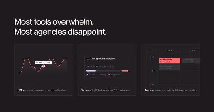
Black problem section with bold headline and three cards using mini UI charts for SDR slowness, tool tinkering, and bad leads.
Summary
Black problem section with bold headline and three cards using mini UI charts for SDR slowness, tool tinkering, and bad leads.
Visual description
Pure black background with large white left-aligned headline Most tools overwhelm. Most agencies disappoint. Three dark grey cards show a flat red line graph with 25 EMAILS SENT tooltip, a time-spent bar mostly testing and tinkering, and a calendar with red Low Quality Lead blocks plus captions about SDR ramp, tool maintenance, and agency leads.
Key takeaway
Fake product UI widgets dramatize abstract frustrations more convincingly than icon rows.
Reuse notes
B2B problem sections before a solution pitch. Red accent should map only to negative data points.
More features sections
See all











More like this

Keep what you find
A free account saves references to boards and can send you a weekly email of picks based on what you save.
To see every result, go Pro.