Preview image. Unlock full-res
Dark grid-backed section pairing a signal-to-record flow diagram with a three-column stats feature grid.
Summary
Dark grid-backed section pairing a signal-to-record flow diagram with a three-column stats feature grid.
Visual description
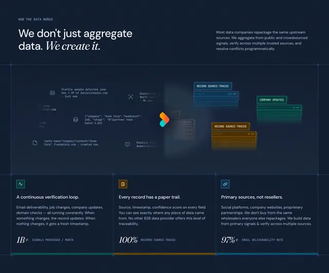
Dark navy canvas with a faint blue grid. Top left eyebrow HOW THE DATA WORKS beside a large serif headline We don't just aggregate data. We create it. with the last phrase italicized; a supporting paragraph sits top right. Center stage is a horizontal flow: left-side floating signal cards (LinkedIn profile update, JSON partner feed, HTML crawl snippet, funding event, connection change) feed into a glowing multicolor RevenueBase mark, which outputs three stacked translucent record cards on the right labeled RECORD SOURCE-TRACED, COMPANY UPDATES, and RECORD SOURCE-TRACED with timestamps. Below, three equal columns each open with a small colored square icon, a bold title, body copy, and an oversized serif statistic (1B+ SIGNALS PROCESSED / MONTH, 100% RECORDS SOURCE-TRACED, 97%+ EMAIL DELIVERABILITY RATE) underscored by a thin color bar in green, orange, or blue.
Key takeaway
Using live-looking signal snippets as inputs makes abstract data processing tangible. Pairing the narrative diagram with hard metrics in matching accent colors closes the story in one scroll.
Reuse notes
Ideal for explaining proprietary data pipelines or verification loops. Requires enough horizontal space for the center diagram; the three stat columns scale down to a stacked mobile layout. Grid backdrop reinforces infrastructure without competing with content.