Preview image. Unlock full-res
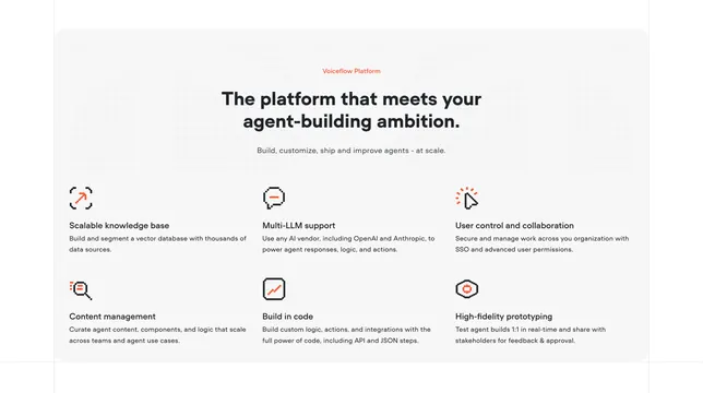
Light contained features block with a centered headline and a 3x2 grid of pixel-style icon features.
Summary
A light, rounded features panel with a centered intro and a three-by-two grid of features, each led by an orange pixel-style icon. The clean off-white card with faint dotted texture defines its calm, friendly feel.
Visual description
A large off-white rounded card holds the section. Centered at top: a small orange "Voiceflow Platform" eyebrow, an oversized two-line black headline "The platform that meets your agent-building ambition." and a single line of grey sub-copy. The upper background carries a very faint dotted halftone texture. Below, six features sit in a 3-column, 2-row grid: Scalable knowledge base, Multi-LLM support, User control and collaboration, Content management, Build in code, and High-fidelity prototyping. Each opens with a small black-and-orange pixel icon (expand frame, chat bubble, cursor, magnifier, code box, hexagon) above a bold black heading and two lines of grey body copy. Spacing is generous and there are no dividers between cells.
Key takeaway
The matching orange pixel icon set tying a light layout to the brand, and the faint dotted halftone that adds texture to an otherwise plain card without competing with the copy. Centering the intro over a left-aligned feature grid balances the composition.
Reuse notes
A solid, low-risk features block for an AI or developer product that wants a friendlier light counterpart to a darker enterprise panel. Six items in a 3x2 grid is the sweet spot for scannability. Pairs naturally with the matching dark "Enterprise Cloud" feature card.